Most artists, especially younger ones, are most concerned with style. This makes sense, because it’s your artistic voice. Which colors do I use? Which colors won’t I use? Is there line work? How thick? Will this look good over your grandma’s couch, or on the wall of an art gallery where the proprietor will give you a condescending look when you walk in? Stuff like that. Unfortunately, I think that we usually give less thought to substance. What is my artwork saying, and what is it saying about? I think that clients, buyers, and your grandma have a better handle on those questions. For the most part, they’re not going to an art fair thinking, “I’m going to get something in a post-impressionist style that has a great handle on vermillion,” but rather, “It’d be great if I can find a cute painting of a rooster for the kitchen” (which by the way, would look great in a vermillion-heavy, post impressionist style). And then they buy the rooster painting that speaks to them the loudest. Basically, what I’m saying is that style should follow the substance of your work (or not follow it, if you’re going for ironic detachment) in the same way that form should follow function.
How we handle style and substance is what defines us as artists, and to better understand that, I’ve put together this incredibly scientific chart:

Not only scientific, but aesthetically perfect too. So, we’ve got two variables, Subjects (synonymous with Substances from here out) and Styles, and you can have either one or multiple of each. Under “One Style, One Subject” we have what are essentially the artist versions of YouTubers or influencers. Artists like Loish. She works exclusively in a painterly, digital art style (has her own marketed digital brush packs) and, by and large, she only draws young women (which a lot of the time look like vaguely anime versions of herself). If we go back before the internet, Bob Ross would be this same type of artist. He only painted wet-on-wet oil and exclusively stuck to landscapes. These are the comfort foods of artists; you know what you’re getting, and it’s gonna taste good every time. And there’s nothing wrong with that! I love Bob Ross, watched him every chance I could as a kid, and have watched through his collections with my children multiple times on Netflix. And I follow Loish on Instagram, wish that I could paint in Photoshop with the ease and skill that she does, and I think she has incredible drawing skills (like way more skills than she actively uses). The thing is, I can’t understand how you can only do one thing. That would drive me insane, repeating myself over and over again. That’s like asking the Beatles to write and record 100 “I Want to Hold Your Hands.” However, that’s what the internet loves, and the “One Style, One Subject” artists have by far the most followers on social media (we’re talking into the millions).
Next are the “One Style, Multiple Subjects” artists. The first of these that comes to mind is Jake Parker. He works in a pen and ink style somewhere between graphic novel and Watterson, usually only changing the amount of detail (to fit the target market) or rendering style (digital, markers, watercolor, etc.), but it’s always very clearly the same hand behind the work. However, he changes up the subjects that he slides into that style. He jumps around between his original sci-fi and fantasy properties, children’s book and cartoon characters, Star Wars and superhero fan art, robots and machinery, and dinosaurs. If you look through his sketchbooks, you see that he’s pretty much up for drawing anything. And that’s key to this kind of artist; you have to be a master of your style to do it. Because he’s got so much pencil mileage, he doesn’t have to worry about how he’ll draw a thing; he can just sit down and draw. Which has to be extremely chill.
Side note here: Jake Parker is the closest thing I have to a mentor. I watch his YouTube videos and listen to his podcasts for career advice, and take his online courses to brush up. He basically has the career that I want: entrepreneurial, freelance artist with a steady family life, who gets to jump back and forth between graphic novels and children’s books, and when he wants to do something new, he’ll Kickstart it and get to work. One day…
At the top of the chart are the “Multiple Styles, Multiple Subjects” artists. These are the people that will change up the medium, the focus of the art, and even the drawing style of the artwork. They tend to do this by focusing on series, catching a muse and riding it until they’re ready to try something else for awhile. My favorite example of this is Mike Mitchell. Off the top of my head, I can think of these different styles/series from him: Fat Birds, Skullies, Food Dudes, pop art cartoon characters, and realistically rendered portraits in profile. And all of them are really well made (I have a bunch of his work on my wall). I love these kinds of artists, because you can see curiousity continue throughout their careers.
But what about the “Multiple Styles, One Subject” people? Who are they? Nobody, I hope, because they would be psychopaths. Who would want to do that, anyway? “Oh yes, I paint in oil, acrylic, watercolor, and sculpt out of woven cat hair, but I only make X-Wings.” The closest I’ve seen to this are the students in high school art that don’t want to be there (or are high), and no matter what the medium or lesson is, found a way of making it a portrait of Bob Marley.
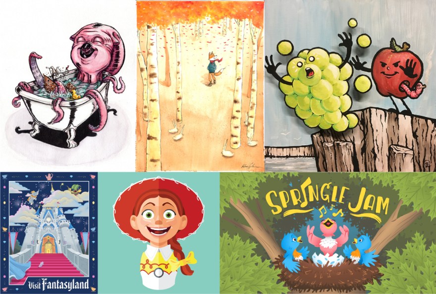
So what kind of artist am I? I’m glad to say that I’m a “Multiple Styles, Multiple Subjects” kinda guy. Here are the styles that I’ve worked in recently:
Inked Illustration

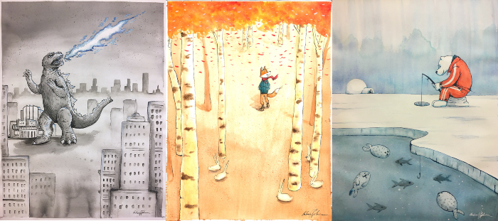
This one is my natural drawing and rendering style, and what most of my sketchbook work looks like. It’s the combination of everything that I absorbed as a kid, from Jan Brett books to X-Men comics, as I was self-teaching. It always starts as ink lines (predominantly brushpen now, because I like how the line weight varies), then I render it out in watercolor, prismacolors, or digital painting. If I lean the drawing more cartoony, it’s children’s book ready; if I lean it more realistic, it’s graphic design work. The subject can be anything, but lately I’ve been tackling anthropomorphic animals and creatures.
Bad Apples

This style was developed to fit the time restrictions of Art Conspiracy’s paint days. You have to come to a warehouse, pick up an 18×18″ piece of wood, and turn in a finished piece of artwork the same day. So I planned out a way to do that without wanting to die (like I did the first year I did an impressionistic style portrait of my son). Bad Apples start out as rough pencil sketches that are then scanned into the computer, outlined in vector (for a smooth, fluid look), printed out to size, before being transferred to the painting surface. That’s a lot of prep work, but it allows the drybrush style of acrylic painting that they’re finally rendered in to be knocked out in several hours. It’s all finished off with black paint pen (another time restriction choice, allowing me not to worry about edges at all during the painting process). The subjects vary, but they’re always cute representation of something off-center or macabre. As my work has gotten more family friendly than I’d ever guessed for myself when I was in film school studying Fincher and Tarantino, I see my Bad Apples as an outlet for darker feelings and gallows humor. They’re also almost all about eating, and there’s no way that’s not Freudian in some way…
Flat Pop

I stumbled on this style several years ago doing graphic design, when flat design for advertising illustration and icons were all the rage. I did a couple simple portraits then thought, “Hold up… what would happen if I really pushed this thing with some more complexity?” I tend to focus on pop culture entities that I love, but this style could be used to make portraits of anyone. They’re always made in Illustrator, clicking around with the mouse, tracing over a pencil sketch (that I only have draw half of, since they’re always mirrored). Flat Pops are an artistic outlet for my perfectionism and desire to control my work (since they’re symmetrical). This goes all the way to the Illustrator work file. All Flat Pops are made on one artboard, in one PDF (called the Workbench), using the same color pallette. Basically, these are the closest to meditation that my brain will allow me to get.
Detailed Vector

I clearly need a better name for this style. This grew out of the fact that, since I’ve done graphic design professionally for 12 years now (which I literally can’t believe as I type it), I’m way more comfortable with Illustrator than Photoshop (which I’ve learned is weird for illustrators). The style is meant to echo retro travel posters and advertising artwork from the 50s-60s, so I try to think of these as traditionally screenprinted, down to how each piece is made of only the combination of 7 colors (like there’s no green in Fantasyland or Frontierland; I’m creating those through layered transparencies of blues and yellows). The only use of Photoshop is at the very end, when I use a texture spray brush to add shading and hightlights to mimic half tones in screenprinting. These pieces are kinda a message to myself that in pushing Illustrator as far as I can, I’m now using it in ways that it’s really not meant for, so it’s about time I transition to Photoshop as my workhorse. But until then, I’ll keep making these overly detailed throwbacks.
Fast and Loose

This one’s a new style I’m playing with (starting in November) where I’m learning to let go of control and let watercolor and ink (my favorite way to paint) just hangout and do what they want to do. Simply designed, throwing perspective out the window, using only a handful of pigments, with washes and line bleeds all over the place, these guys are fun, relaxing, and meant to be knocked out in an afternoon.
Cartoon

Designed specifically to be animated, I like to think of these as “Muppets meets Loony Tunes.” Completely vector, they’re shaded using either smooth transparent chapes or gradients. No texture allowed. The characters are friendly, and the youngest artwork that I make.
Wrap Up
So there it is – six styles that I’m working in now. And I’ve actually been paid or made sales off of five of those (Fast and Loose is still just in the home at this point). The unifying thing to all of them is that every piece starts out as pencil on paper, sketched with an HB pencil, before splintering off into each style’s particular process. And that’s what makes them all uniquely mine. Has this variety hurt my social media following? Maybe? I’ve only just recently started posting regularly, so we’ll see. What’s more important is that it’s artistically fulfilling, and if I stick to that, then opportunities will continue to fall in line.
Project Updates
- I’ve completed my first four Adventure Time Flat Pops! I’m waiting to promote them until I’ve got one more completed for a set of five, but these ones are already available on shirts and all sorts of other swag (I’m thinking of getting pillow sets for my kids) over at TeePublic.

- It’s Spring Break and I’m taking some time off to do artwork. I’m going to be making a Redrawn painting, the first in a new series of mini-sculptures, at least one Inktober 52 drawing (and compiling the first 9 into a coloring booklet), reworking this website, and rescanning some of my paintings with the thought of selling prints in the future.
- For a deeper dive into my styles, you can check out my portfolio on this site, which I’ve just rebuilt to not focus on all the things I can do, but only on the things I want to do.

