Thought I’d officially wrap up the year with a review of the favorite five pieces of artwork I created in 2022, presented in no particular order, aside from how I feel about their relative quality at the moment I’m writing this.
5. My Wedding Invitation Portrait
Are these portraits perfect? Nope. But I feel like I nailed the style, got to really watercolor paint for the first time in Photoshop, and this painting obviously holds huge sentimental value for me, so it HAD to make the list.
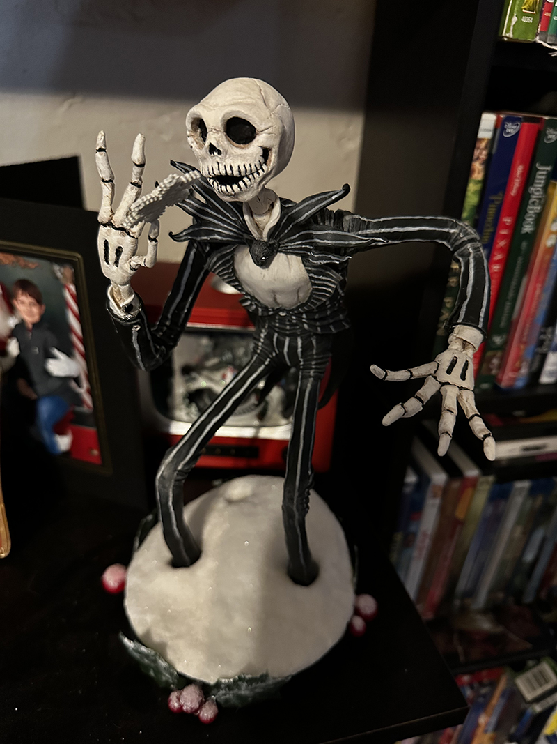
4. Jack Skellington
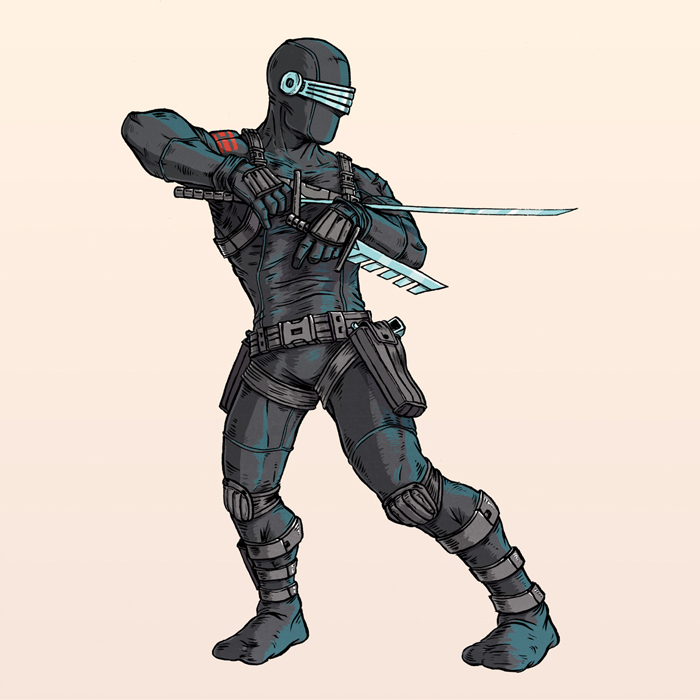
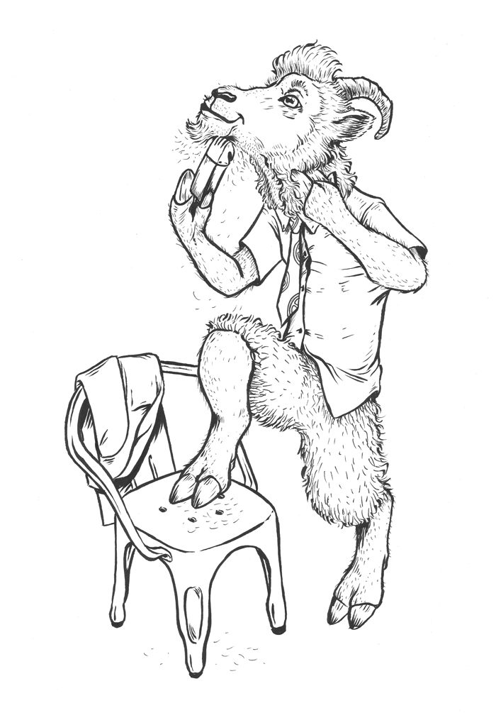
This is the last project I completed in 2022, just in time for Christmas, and so new that it doesn’t even hasn’t even made it to my portfolio yet. Aside from just generally really liking how it turned out, I’ve included this sculpt because It’s a project I had to save. Originally intended to be completed for Christmas 2021, I had to put it on the back burner once I realized I had completely botched his head and hands (the original skull actually made it into a pirate octopus diorama made by my daughter). So I returned to it in December, regrouped and refocused, and knocked out a head I was proud of, refinished the base, and put together two hands that I could accept 😉
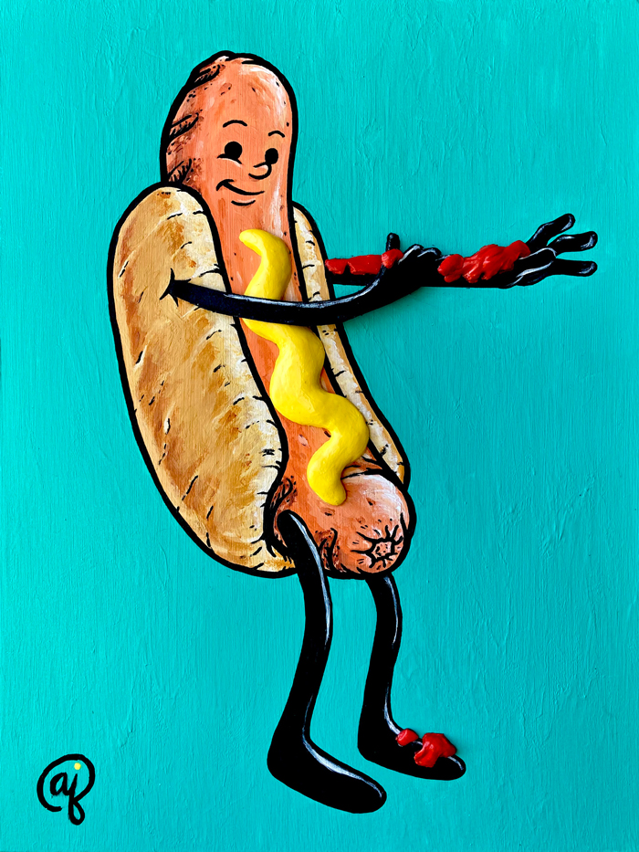
3. Why Not Both?
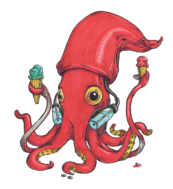
For my annual return into my Bad Apples collection, I pushed the 3D element further than usual, this time using sculpey clay (what I use for almost all my sculpture work). It must be affective, because my daughter still thinks the ketchup and mustard looks real. Still need to make a print of this guy though…
2. Trick ‘r Treater #1: The Headless Horseboy
Coming from a similar situation as Jack Skellington, this ink and watercolor painting sat in my closet (even making a home move unfinished) for 2 years after I missed finishing it for Halloween 2020. This year, I learned my lesson, brushed the dust off of it in September, and finished it in time for the holiday. I can’t wait to add to this series every October, and I can’t wait to see which little monster walks down the sidewalk this Halloween!
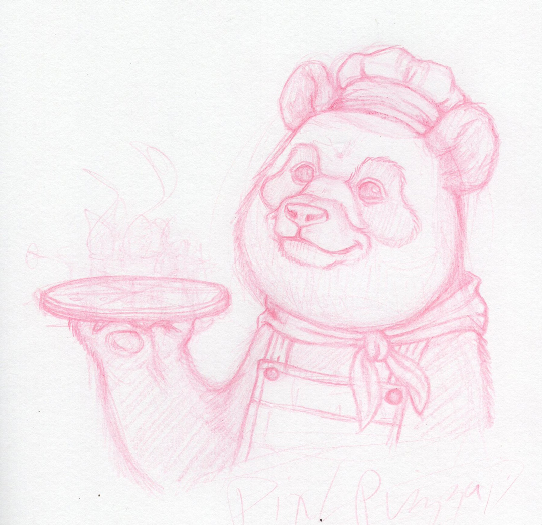
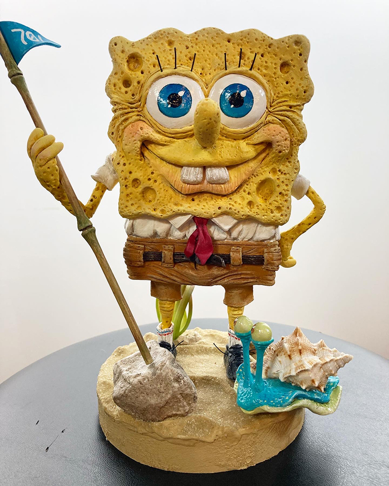
1. Spongebob Squarepants
Quite simply, this is the best sculpture I’ve ever made, and might be the best thing I’ve ever made period. One of my art goals for 2023 is to bring this level of quality and detail into everything I create.
PROJECT UPDATES
My next post (coming Friday the 13, appropriately enough) should include some new developments for at least a couple of ongoing projects.
First up, I’m getting close to finishing this illustration that I started at the end of 2022. Its idea originated in March of 2021, and I’m more than ready to see it finally finished. I’m at the point now where all I need to do is finish laying in the lighter values, shadows, highlights, effects, and final texture. Well, that sounds like a lot, and it probably is, but it should move much faster than the work has that got me to this point.
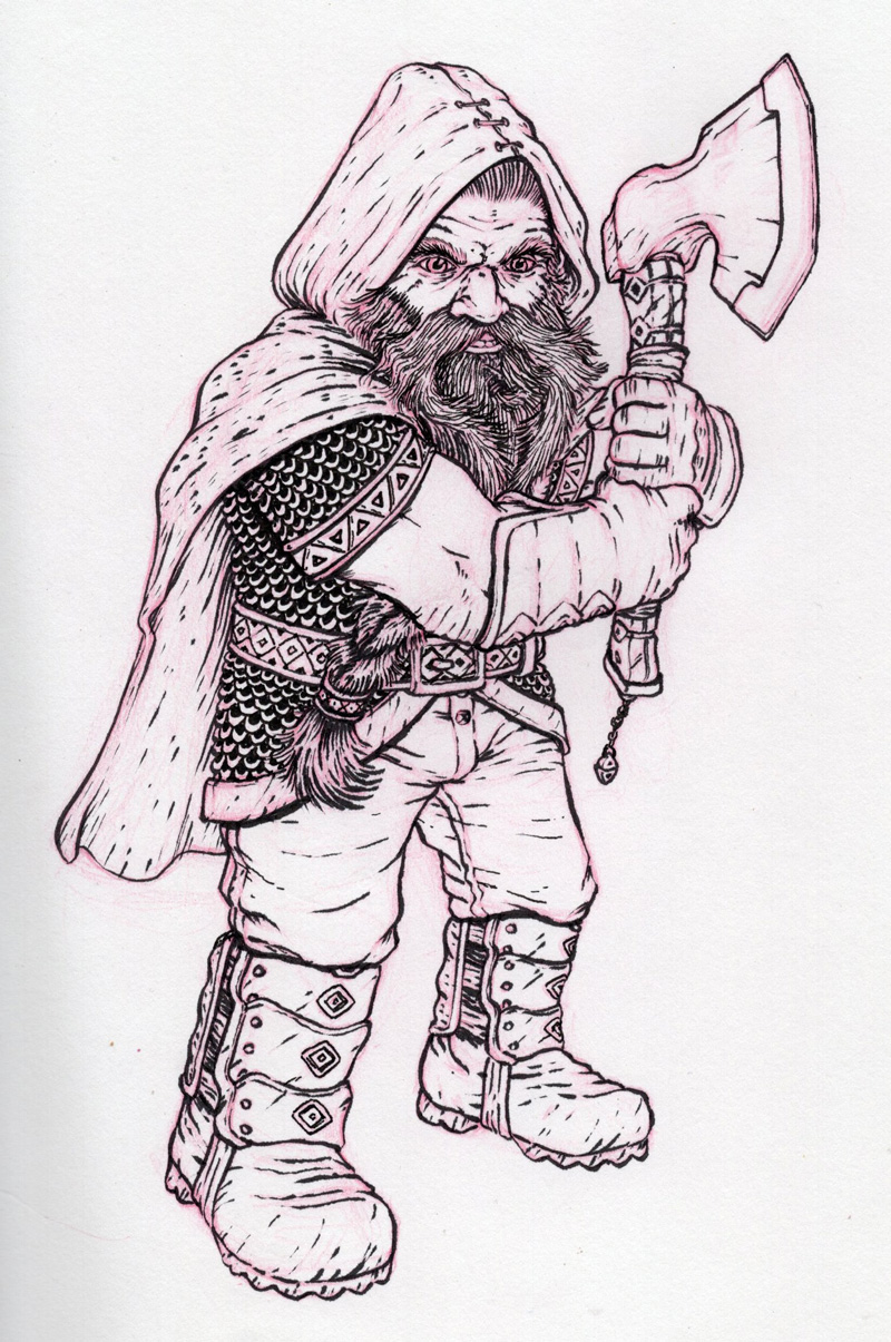
Year of the Ring
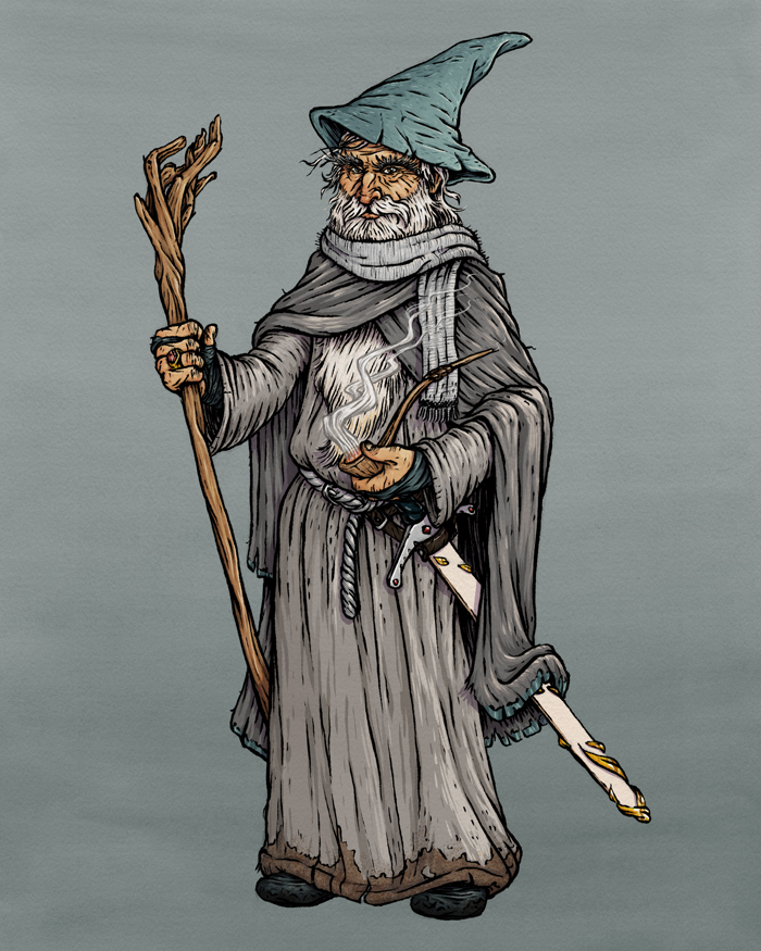
As per usual for me, I way overplanned and overscheduled 2022 to work on Year of the Ring character designs. I’ve cut those plans to a more focused and finishable project scope, and I’ll keep working on it throughout 2023. As of now, I’ve got this ink drawing of Gimli ready for color, and another sketch to be finished and inked this coming weekend.
In this Part 2 of my “Hey, I’ve been gone a long time, but here’s an update on my artwork” series, I’ll be sharing the sculpture projects I’ve completed in the last couple years. When the pandemic hit in 2020, and I was stuck in my apartment with a 5 and 7 year old for a few months, I needed something to focus on to keep my sanity (and, yeah, sure, working on projects with the kids was a nice bonding bonus too). So, I picked up some Sculpey clay (I’d worked with it a bit a decade before), and started knocking out some sculptures. Now, for the sake of order and convenience, I keep my sculpture work on another website and another Instagram account, but I wanted to highlight that work here, since over the last few years it’s taken up a big chunk of my creative output’s time.
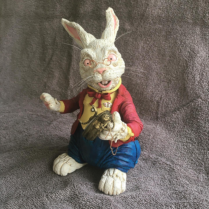
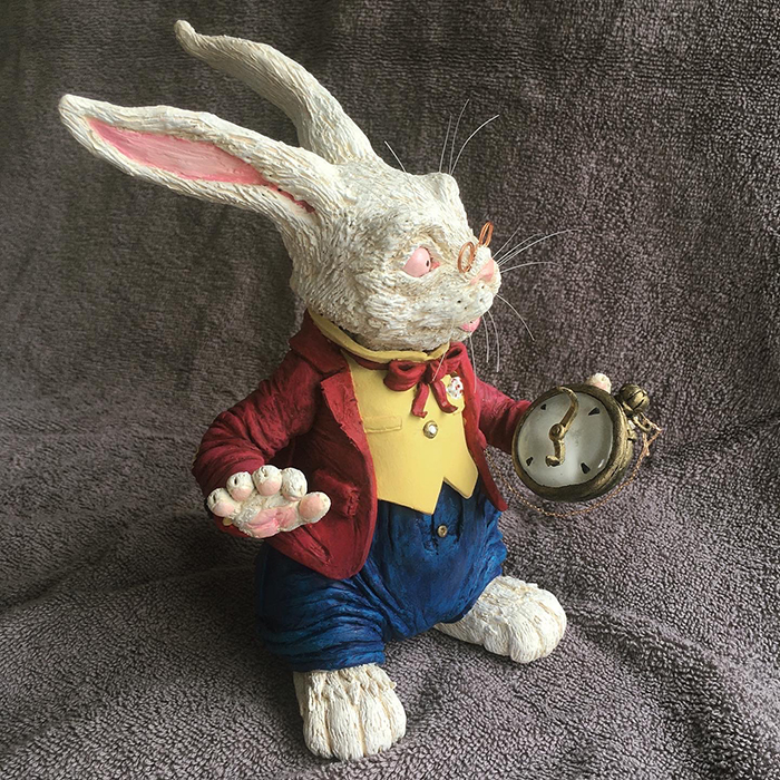
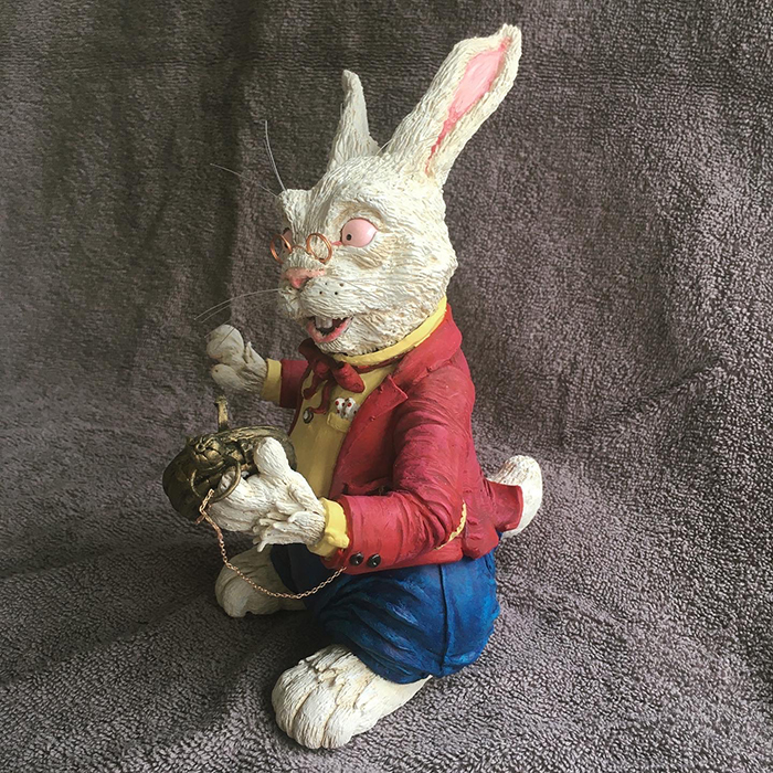
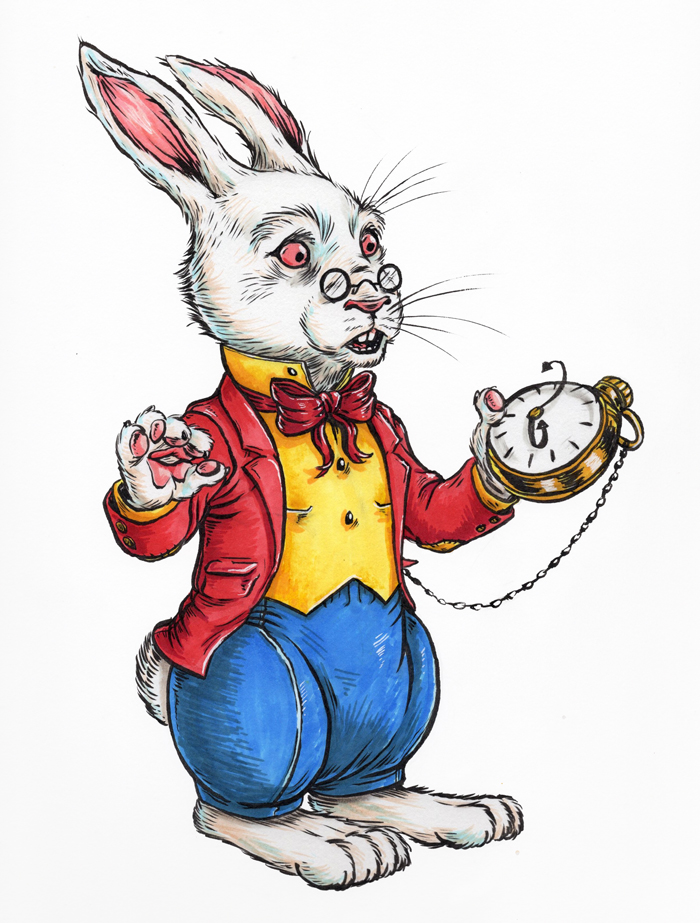
White Rabbit: I’m not sure why I picked him to start my sculpture journey (actually, it probably got in my head after watching this), but I jumped into it full force, relearned how to work with polymer clay, and ended up really happy with the end product, especially the texture of the hair. If I was to do this again today, I’d push the paint job further and put more effort into the pocket watch. But all-in-all, not bad for a first real attempt.
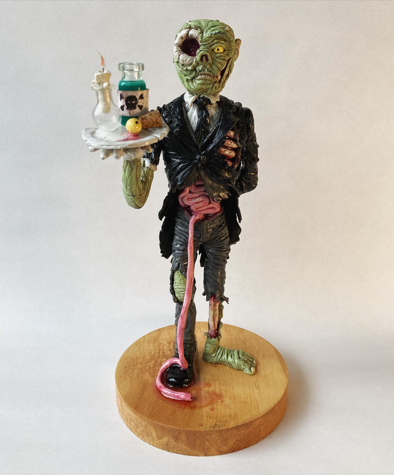
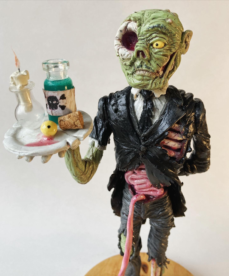
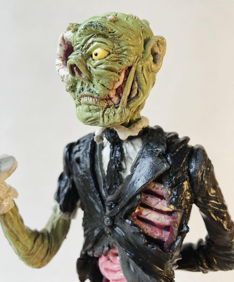
Reggie: I had gotten my kids zombie sculpture kits from Ace of Clay, so I wanted to do my spin on the project as well, which would give me the opportunity to do more challenging details and effects. I think he’s suitably gross and creepy in a fun way, but the varnish I used is a little too glossy on the skin and clothing (I changed to using a different matte varnish after this), and the head shape isn’t quite right. I still really like him, and would like to make ghost maid companion for a future Halloween.
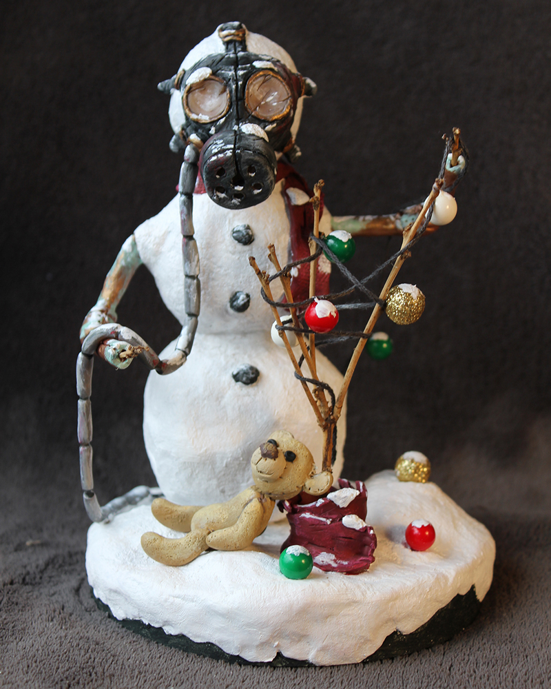
Blitzby the Snowman: I made this post-apocalyptic snowman as part of an online Christmas sculpting challenge. By this point I’d locked in which varnishes I liked to use, was more comfortable mixing and matching textures, and started adding elements to the character bases.
Trixie Treats Herself: This is my first sculpture where the inspiration was one of my finished paintings. I had a blast creating something more cartoony, and it was a lot of fun making the chocolates. The one big mistake I made, however, was trying to save time by spray painting the red of her candy box body. I ended up completely painting over it anyway (because it was to firetruck red), and it created this weird tacky texture and finish. Just gonna stick to paint brushes from here on, until I have some time to teach myself airbrushing.
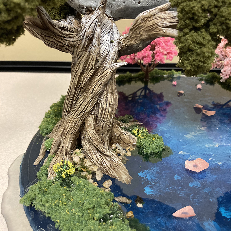
Moonrise: I then shifted gears from characters to make a diorama. I used this project to experiment with including pre-made minatures and foliage, terrain, and larger scale resin pouring. My daughter is the only person who remembers that this isn’t technically finished (based on my original sketches), and won’t let me forget that I have to get around to incluing the little black bear fishing off the side of the moon and the paper lanters floating down the river.
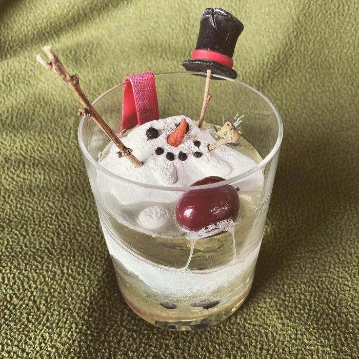
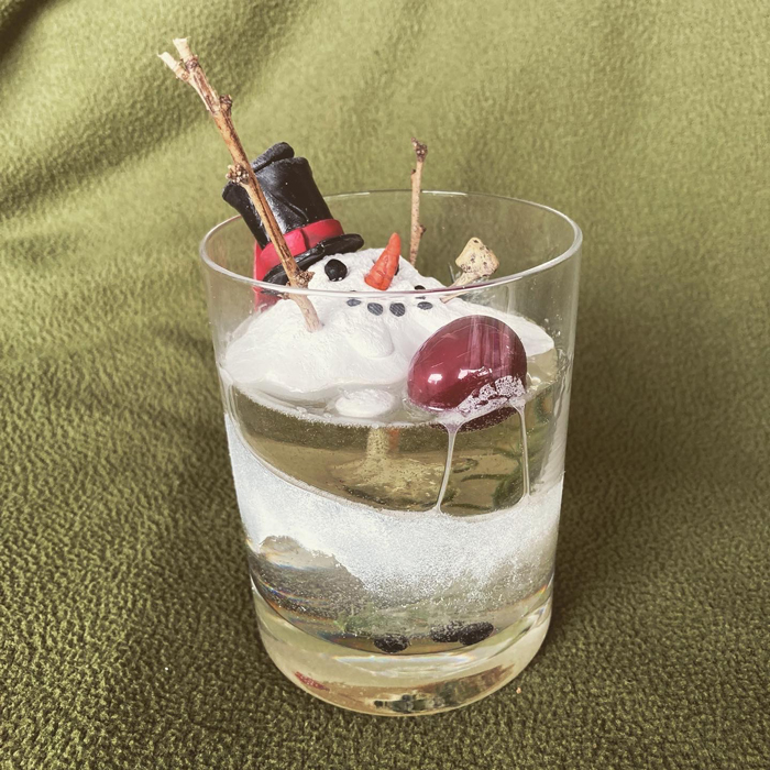
Frosty Shot: Just a snowman melting into a cocktail. I love the details on this guy. I’d like this to be an annual series, but I don’t think I’m going to have time to get a new one done in the next few weeks before Christmas 2022 (I’ve got a couple other projects in progress that have to get finished first!).
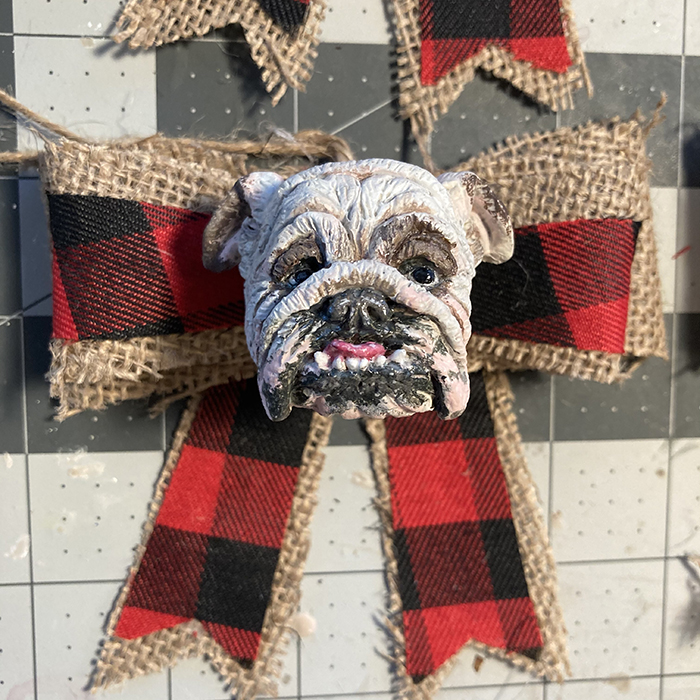
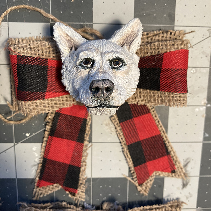
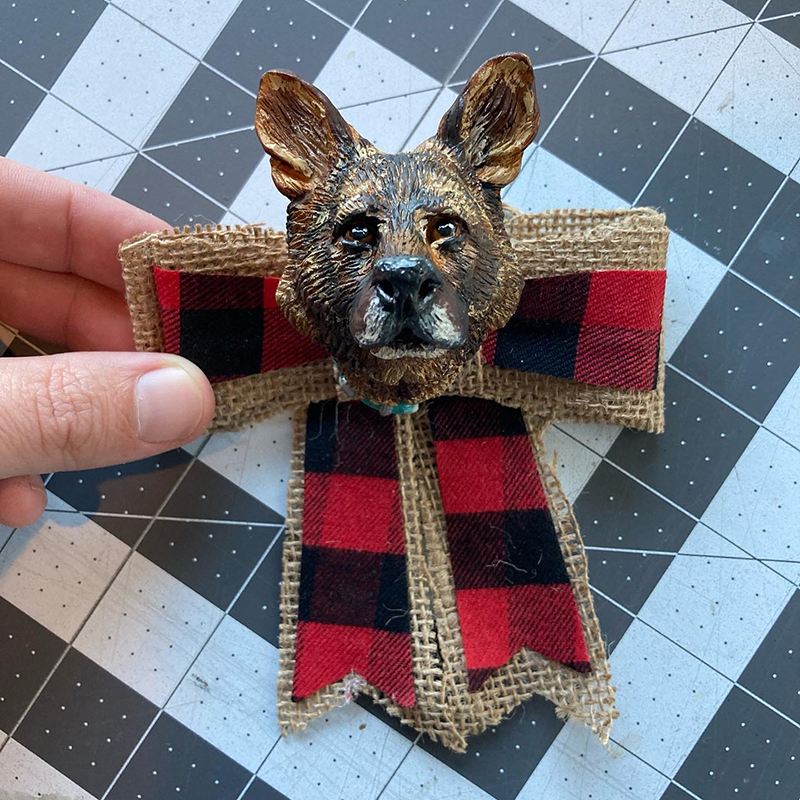
Speaking of the Christmas, I’ve also made a handful of ornaments for friends, including one that was my first every sculpture commision!
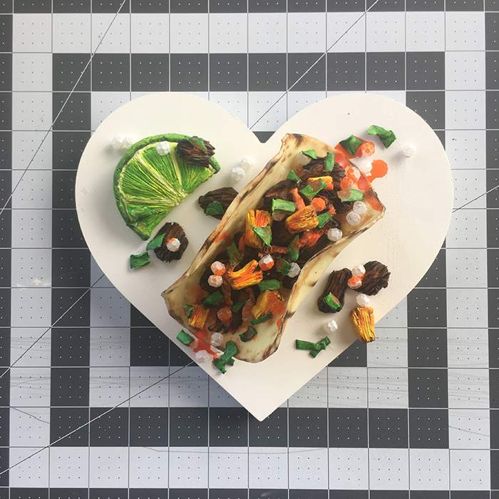
The one annual series that I do have going is my Hearts. Every February, I create a sculpted valentine to commemorate someting I loved in the previous year. You can seethemhere.
Spongebob: I made this most recent piece for my step-dad as a combo housewarming-retiring-turning 70 gift, and this is the one where it all came together for me. Mixing textures and finishes, a mixed media base, and nailing all the details I wanted to highlight.
Spongebob also served as a turning point in my online career. As of today, between Instagram and TikTok, the painting process video has 58,400 plays, which is an insanely high reach for me, when I’m usually lucky if 200 people see my work. Mixed into the comments (mostly positive!) were quite a few asking me to actually create more stuff, which is really exciting and motivating. But at the same time, with that visibility comes accountability, and I know that every creation from this point on has to be at least as good as this one. And that’s a challenge that I can’t wait to tackle!
Man. It’s been almost 15 months since my last blog entry. A LOT has happened in that amount of time. Let’s take a look, by way of a helpful, bullet-pointed list:
September 2021: I started a new job as the Creative Director for video and events production company. It’s a great fit, and I get to do lots of illustration, design, and art direction (I’ll touch on some of those projects in a future post).
December 2021: I got engaged!
April 2022: I got married! My little family of three pretty much doubled, because now I have a wonderful wife and step-son, and two dogs. Oh, and we all moved in together into a house.
August 2022: The three kids all started at a new school. Thankfully, it’s right next door to us, so mornings and afternoons are way easier and less stressful than they were in the single-dad years.
Now, that’s just a short overview of the last year (my wife and I also went on a couple great trips too), and doesn’t cover all the art I’ve put my hand too in that time. For that, I’ll need to break the updates up into catagories: illustration, sculpture, and animation. Let’s start with…
THE ILLUSTRATION UPDATE
In February of 2022, I took part in the Love for Kettle art auction again. My piece this time was, “Why Not Both?”, an acrylic painting on 9×12″ wooden board. Since I like to work 3d elements into the Bad Apples series, I decided to try something new and create the condiments out of Sculpey clay. I was delighted to find out that this painting was bought by the owner of my previous entry, “Hold the Pickles” – which has got me thinking of how I can create a bookend piece that would give them a nice trilogy in February 2023.
This summer, I announced a big project: Year of the Ring. This was designed as a way to get me back into regular work after the marriage and move, so that I could do character designs and sculpts based on Lord of the Rings without having to exert too much energy into creating my own IP. However, because I am what I am, I way overbooked and overscheduled myself with ideas, which immediately got blown up by getting a much more creatively demanding day job. However, I’m very happy with the pieces I’ve created so far, and will continue to tinker away until I’ve at least illustrated the Fellowship…. except Gollum and an orc or too would be really fun to draw….
Here’s the illustration I made for our wedding invitation! We were going for a very specific, muted ink and watercolor style, which I’m sure I overworked a bit. This was a traditional-digital hybrid project, starting with a rough pencil sketch on Bristol paper, then scanning and cleaning up the proportions in Photoshop, then printing that onto 140lb watercolor paper and inking with brushpen, before finishing things up by scanning that back into Photoshop and painting digitally.
Since my wife, Katelin, is wise, she is pushing me to finish up hanger-on projects before starting new ones. First on the list was the Headless Horseboy, whom I had drawn, inked, and put down the base colors in watercolor in October 2020. When I didn’t get him done in time for Halloween (probably because I was a little busy making something else), the painting got put in the closet and kind of forgotten for two years. Thankfully, it survived the madness of the home move, and I pushed through and got it completed for this year’s Halloween; even releasing a print for sale. I’m excited to see which little monster walks down the sidewalk in 2023!
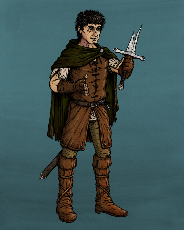
And then there’s this big boy. Starting as an answer to the SVS prompt of “Fairy Tale Traveler,” I went into this as mainly an excuse to discover and dial-in a digital inking process that would perfectly match my traditional brushpen work. A) I happily nailed it and B) I stumbled on an IP idea that is taking up a lot of my headspace (remember how I specifically did NOT want that to happen for at least a year?), and I’m itching to flesh it out. What I know right now is that this is Quentin, who is on a quest in the Land of the Dead to find out why his family has vanished to the Land of the Living. However the story pans out, I’d love to create this as a graphic novel, or a heavily illustrated novel, a la “The Invention of Hugo Cabret.”
Well, that wraps things up for the Illustration Update. My goal is to publish a blog every other Friday (and if I can do that for a year, adding a newsletter to the mix), so by the time I write the next one, I should be pretty far into the drawing of a pirate mutating into a were-raccoon. It’ll all make sense then. Trust me.
I think everyone can agree that the last year was insane. For me, it was definitely nuts juggling full-time graphic design, pushing ahead on illustration work, and fathering a second and first grader as their never-ending Spring Break stretched into the first month of the next school year being remote as well. So, for the sake of sanity, I had to step back from writing here.
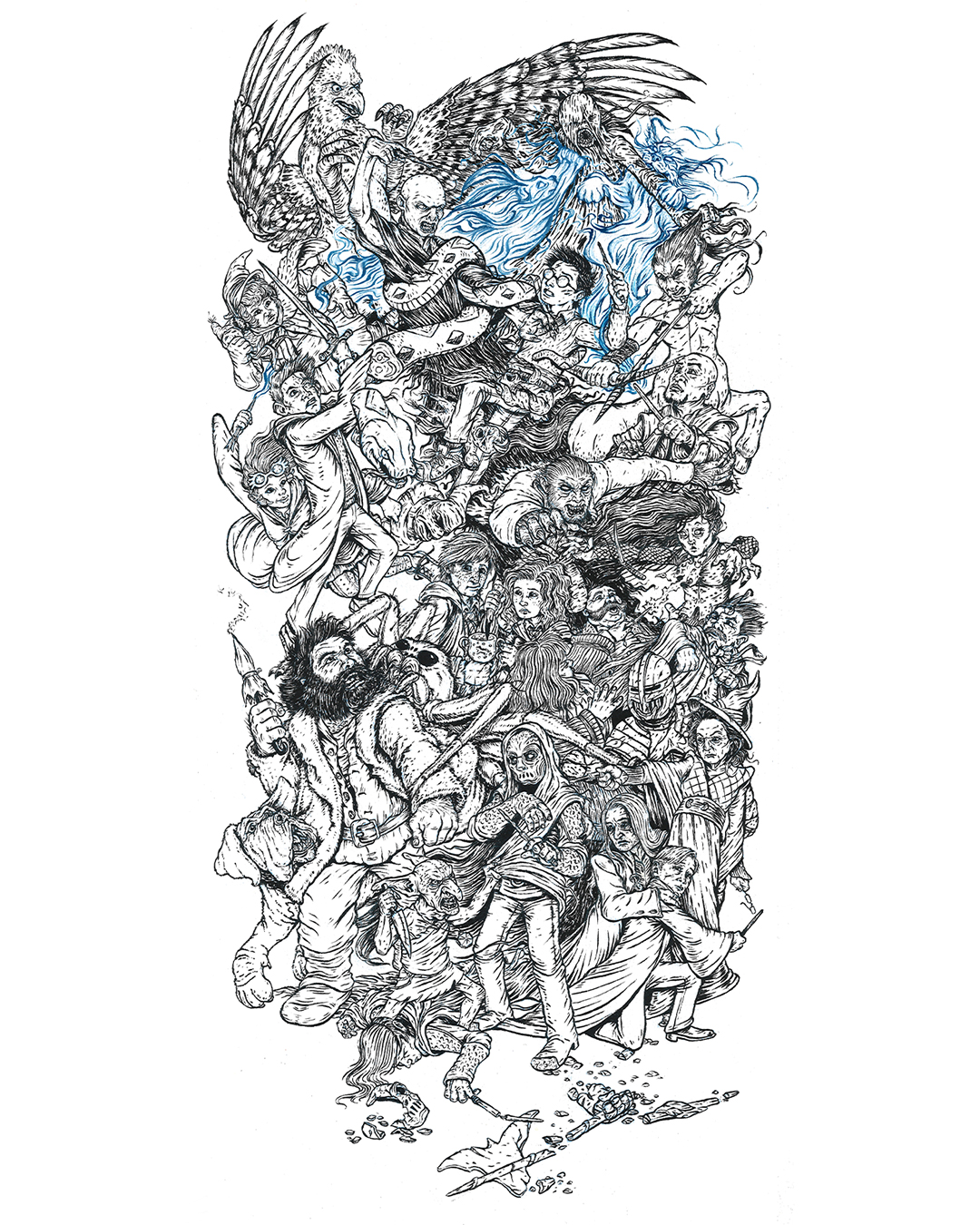
But, as I said, I’m back, and just in time to post-op how Inktober went for me last year. For those who don’t know, Inktober is a social media art challenge where the goal is to post an ink drawing every day in October, and by doing so, you improve your skills and hopefully grow your audience as an added bonus. In 2020, I wanted to do something different, so I planned to do one huge drawing with 31 characters, and post my process as I drew and inked one character a day. For multiple reasons (but mainly because I thought it would be fun), I chose to depict the Battle of Hogwarts, the magical war deciding skirmish that closes out the Harry Potter series.
My first step was to re-listen to the audiobook. I took note of which characters were involved, where and when they were, and as many physical descriptions as I could (“which cheek of Harry’s got cut again?”). From there, I put together a list of which 31 characters could be included. Once I’d worked, and reworked, that, I grabbed a 12×24″ piece of newsprint, and drew out what was in my head as quick and ugly as I could.
Once I numbered the characters to the days that I would post them, it was time to start on the drawing. I taped a 12×24″ piece of 300 lb watercolor paper to some foamboard, grabbed a non-photo blue pencil, and started to work. Now, I’d never used this type of pencil before, but knew enough about comic book illustration and animation from the past to know that it was designed to be easily removed from inked artwork. I found that as an added bonus it worked beautifully on the watercolor paper, and fell behind the ink lines in a really appealing way, which allowed me to skip over erasing my piece day after day.
That first day was a challenge, because I chose to do Kreacher, a small elf in the front. This helped set the style and scale of the characters moving forward. However, I knew, but it wasn’t visible, that he was crouching over a casualty of the war who wouldn’t be drawn for another 19 or so days. That right there was the biggest problem to solve in the drawing – drawing in characters meant interact with other characters who were basically invisible. Of course, I told myself that I would work ahead, but that rarely happened, so the best I could do was to block in the forms of where a handful of characters would go at a time before jumping back and forth around the paper. I would work on it at night between 8:30 and 10:30 (once the kids were in bed), with the occassional early morning in the office to finish the inking on the drawing from the night before.
It was equal parts dizzying and fun, and here’s what I ended up with:
I am really happy with how it turned out, because it’s exactly what I had in my head, and I didn’t compromise on the attention to detail. You can check out the full project page here.
The biggest frustration with the project actually came from the social media side of things. About half-way through the month, Instagram apparently messed with their algorythm (or the amount of #inktober drawings just became too much to cut through), and the reach I was getting was affectively cut in half from what I had in the first week. Which is pretty messed up, since posting every day and getting audience interaction is supposed to increase exposure. Unfortunately, the opposite happened, so a lot of days it felt like I was just releasing scraps of paper into the harsh wind of the internet. Then at the very end (we’re talking about the day that I posted the final drawing of Harry), Instagram made it so that it was impossible because search recent posts for all hashtags because of garbage surrounding the U.S. Election. Now this sucked a lot. I was hoping to build my following with 100 new followers, but as October closed, I had only gained a net of 28. In the end, I was able to find a bit of follower and like redemption, but I had to use a paid Instagram advertisement to get my work in front of the people who really wanted to see it (you win again IG).
But, here’s the deal: social media is an illusion, and this project was a wonderful reminder of that. The amount of likes and follows your art generates is in no way a reflection of quality of your work. If that were the case, every anime piece would get 12 likes, instead of being inexplicably popular. In the end, I’d rather have the one person who wrote a really nice message about how much he loved this piece and how he thought it was the most impressive thing he’d seen created for Inktober that year than a few hundred anonymous likes. And hey, I even managed to sell a few of the prints, which you can get here!
Hmmm…. It’s October again in just a little more than a month. Might as well start planning for the next Inktober…
Project Updates
Seriously? Way too much has happened in the last year to give you a full rundown, so I’ll just drop in some of my favorite projects I’ve knocked out in that time. The one thing I will call out is that I signed up for and took the inaugural Children’s Book Pro course over the summer. Now, the summer is particularly tough for my schedule (without school be around to helpfully kidnap my kids every day), so I wasn’t able to get to all the assignments, but I did make it through all the lectures, and there was a lot of good stuff in there. Once we really make it into fall (instead of me just fantasizing that we’re already there), I’m going to jump back in the course work, so keep your eye out for illustated pieces from my take on Little Red Riding Hood.
Oh man. I’m alive. It’s been a crazy busy last few months, but I’m back. I’ll have a more in depth update and blog in a few days, but tonight I want to share the process steps for a new piece I just finished, “Ellie and the Ink Fairy.” I created this one for SVS Learn’s September illustration contest (rules stipulated that it needed to be black and white, and made in ink (or made to look like ink)).
At some point (hopefully soon), I’ll be adding value in Photoshop so that I’ll be able to add a grayscale image to my portfolio.
A couple weeks ago, I was all set to create a painting. I had thumbnailed the concept, rough sketched the idea out further, cut the 300 lb watercolor paper to size, taped it to my drawing board, and set aside the time to make it. And then I didn’t do it.
Part of being a creative person is learning when to bail on a project. You’ve thought up this amazing idea, artwork, or product. You may have even planned every step of the creative process. But then, for some reason, it becomes clear to you at the onset (or during the project) that it’s not the right thing to work on right now. The young artist (and I know I was like this) will try to shove that thought down and push forward, not wanting to have wasted the time spent prepping the project. This is a mistake. The mature artist listens to their intuition that one of the following realities is true.
1. THE TIME ISN’T RIGHT
This is when your situation or the world changes and you have no control over it. Case in point: the painting I was going to make a couple weeks ago. I actually wrote a bit about it in my last blog entry. It was for the SVS May illustration contest, and needed to address the topic of isolation. My idea was to show how it must feel, in a whimsical way, for an intelligent animal to live in a zoo. Surely, it must feel like being in solitary confinement in a prison cell. So I was going to have a chimpanzee relaxing in a tire swing, reading a book and eating bananas in an orange jumpsuit. There were going to be day tallies and chalk sketches of nature on the wall, coconuts turned into weights, and maybe even an escape rope made out of bed sheets stuffed in a corner. You know, just hitting some areas where life in a zoo and life in prison would overlap.
And I was excited to get starting. But then something major happened in the world a few days before I started the painting. A Minneapolis police officer murdered George Floyd, a black man, in the street, in broad daylight, on video. This proved to be the final straw in a long line of black men and women unjustly killed by the police or white vigilantes, and America exploded into protests for justice and reform.
After days of processing what had happened and what was growing and building into the larger Black Lives Matter movement in this country, it was clear to me that I couldn’t make the painting I had planned. There was no way that I felt it was appropriate to do anything touching on the criminal justice system, and I definitely didn’t want to give any racially charged person something to read into in my zoo analogy (specifically the chimpanzee character and the bananas, which racists have used to insult black men and women in the past). I didn’t want to unintentionally offend anyone in this time of pain, and I didn’t want any political message read into my work that I didn’t intend. So, I folded up my drawing board, and leaned it up against the wall.
Sometimes the world changes, and there isn’t anything you can do about it. Maybe you were about to launch a series of work concentrated on flames, and then all of Australia catches on fire. Maybe you were about to start a graphic novel about space ships and the crews that run them, and the Challenger explodes. Put your pencil down. This is not a failure, but an opportunity to prioritize reflection, education, and finding out how you can help or change what is happening around you.
2. YOU AREN’T RIGHT
These are the circumstances that are tied specifically to turmoil or major change in your life, both positive and negative. Relationship struggles, the birth or adoption of a child, the start or loss of a job, a move, a divorce, your child’s behavioral issues, or a family emergency are all massive shifts in your life, and when you’re shifting is not the time to work on a major project. Mental health issues like depression, anxiety, and loneliness shouldn’t be ignored so you can force out your big dream. They need to be addressed, and your art can wait while you take care of yourself and your loved ones. When you’re in a better place you will be so much stronger and better equipped to do the things you love.
3. THE PROJECT ISN’T RIGHT
Sometimes, the issue really is the project, but not because it’s a bad idea. Maybe it’s TOO good. Maybe it’s too big and complicated for your level of experience or the amount of time you can commit right now. In that case, try working on something similar but smaller. Instead of a graphic novel, illustrate the first few pages as a standalone short comic. Instead of a huge landscape painting, paint a series of 4-hour studies. Or maybe, the project is too small for you. Maybe you’re at the point in your career that doing online art challenges is taking you away from your life’s work. Maybe it’s time for you to sacrifice the immediate for the long lasting. Take a step back, think hard, and make a list of your goals, then plan where you want to be in 6 months, a year, and 5 years. Does this project fit in that plan or get you closer to your goals? If yes; great! If no; bail.
But I’ve got some great news:
BAILING DOESN’T MEAN IT’S FOREVER
Saying no today doesn’t mean saying no for the rest of time, and just because a project is right right now doesn’t mean that it won’t be right when the world, your life, or your experience changes. My painting “Cruise” was originally supposed to be for a contest in January 2019; I ended up painting it for Slowvember in November of that year. My painting “Treat Yourself” was planned for February 2019 before it got shelved; it was painted as an entry in a fundraiser for a local art gallery one year later. Even now, for my zoo/prison painting, I have plans to bring it back in the future. My kids have smartly suggested that I include an orangutan so that there’s an extra character and give the animals old-timey black and white striped outfits, and I can’t wait until the time is right to pain it.
When you need to bail on a project, write it down and set it aside, so you don’t have to worry about it anymore. I keep a notebook where I write down the illustration and painting ideas that I can’t get to so I can return to them when I have an opening in my schedule. Some ideas even end up on scraps of paper that I put in my “Idea Debt Jar.” If things get slow at work, I can always pull out an art idea at random to work on. Whether you like the notebook, the idea jar, a google doc, or stone tablets, the point is to remove the weight and guilt of dreams defered from your mind. You need that creative energy and mental space for the right project for right now, and that right project might be the wrong project yesterday, last month, or last year.
PROJECT UPDATES
Inktober 52 keeps plugging along. I’m still behind, but at least I’m not falling even further behind. Here are the drawings I’ve done in the last few weeks:
Speaking of Inktober 52, I got enough of them done to put together a second volume of coloring pages that are available for free for anyone looking for distractions from the disappointment of a lost school semester and a global pandemic. Fun note about these: the Instagram post promoting it (independent of the boosting I did) became my furthest reaching art post, and became my first to pass 100 likes!
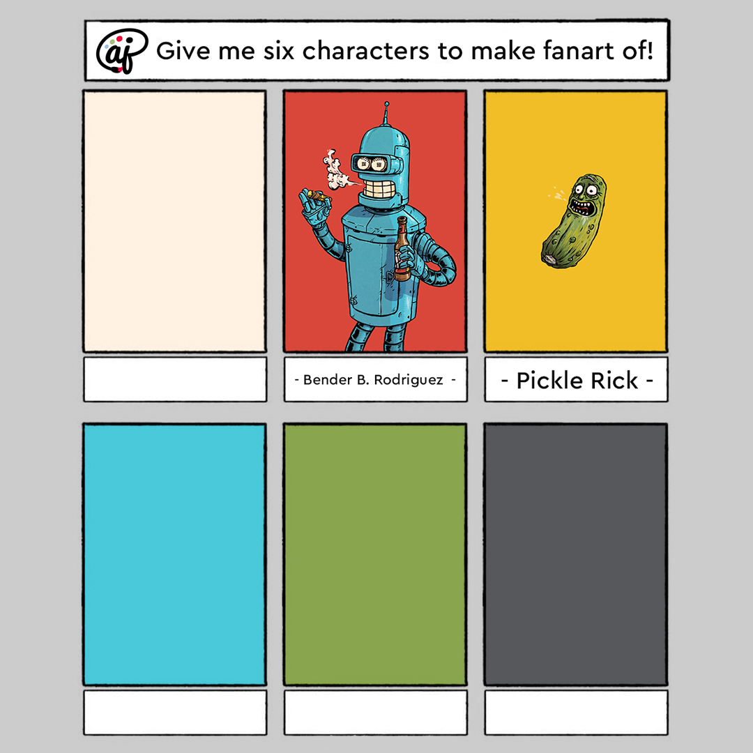
I’m almost done with my 6 Fanarts project, and most of it has been really fun:
The upside of bailing on May SVS contest is that I have my paper prepped and ready to go for the June contest, so I won’t (fingers and toes crossed) wait until the last minute to start work on it. Also, its prompt centers around a monkey really hungry for oranges, so I was on the right track, just in the wrong month.
Hey, I sculpt too! I’m playing with the idea of making maquettes for my characters at the beginning of big illustration projects, like picture books and graphic novels, so I’m doing a trial run with my version of the White Rabbit from Alice in Wonderland. I’m guessing my next blog will be the documentation of how that goes down. Hint: it’s a huge success (hopefully)!
Long time no post. After my last writing, stress just kinda built due to the virus lockdown, and it knocked me sideways. Isolating and staying at home, turns out, is EXTREMELY not good for young kids. Really, it’s not good for anyone, but especially 7 and 5 year olds. So some shifts in classwork and work-work scheduling needed to be figured out, and my brother and sister-in-law stepped up to help the three of us get some space and time apart. All that added up to me basically losing any steam to draw or paint in early April. The good news is that hitting that snag really underscored a big mental/emotional/spiritual need for me:
I NEED ARTISTIC COMMUNITY.
This has always been a problem for me. I’ve always been the art guy. I was drawing before I could talk, I was always the best artist every step of the way from kindergarten through high school, and even in college all my roommates were computer science or software engineering majors. Basically, I’ve always been doing this alone.
And that sucks. It’s exhausting. And it’s lonely. And that sure wasn’t going to get any easier in a global pandemic, because there was no way to find an art community (outside of the SVS forum that I take part in). So, the only option was to take the bull by the horns and create one. I knew that my buddy Ben from work had been getting into oil painting over the last year, so I pitched the idea of creating an art group with the goal of encouraging, critiquing, and holding each other accountable to keep working on our projects. He was in, and we then invited another friend from work, Jason, to join in. He had never painted before, and wasn’t sure of his artistic prospects, but was looking for a new hobby to pass some of this downtime. Each time our group meets, we’re all tasked with sharing updates on what we’ve worked on, what we’re working on now/next, and what skill we’re focusing on improving with our current projects.
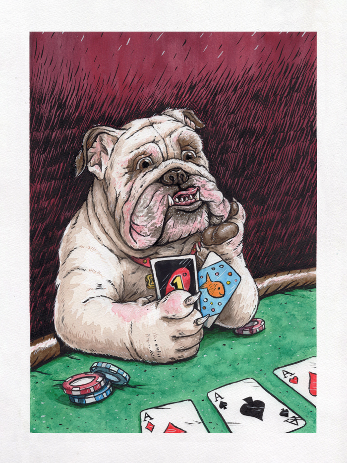
Since then, we’ve met twice, and plan to continue Zoom meeting once a week or two to keep each other moving forward. In our first meeting, we chose that we would all paint a portrait of Ben’s bulldog, Winston. I’ve chosen to work in oils for the first time since… 2006?… and got a rough sketch and color palette ready to share at the next meeting. Unfortunately, that meeting wasn’t able to go down, because work got a little out of hand at the last minute for Ben and Jason. Well, I didn’t want to start on the oil project until I’d gotten feedback on the rough sketch, so I decided to not sit around (I’d been doing way too much of that already), and threw myself into a quick ink, watercolor, and gouache warm-up illustration. I call it “Bulldogs Suck at Poker:”
I really love how it turned out, and it already has my mind spinning about thinking up different things that animals surely suck at.
But back to the real painting. Here’s that rough sketch, and the color palette I’ll be sticking too:
Since this is going to be a long term project (because oil takes forever to dry), I’ll keep you posted as updates are available. My favorite take away from the new art group (aside from hanging out virtually with my friends and not talking about work for a change) is that it’s snapped me out of the slog and has made me super productive again. Evidence being (aside from the extra painting I already made just to surprise the group)…
PROJECT UPDATES
During my short term art depression, I fell behind on Inktober 52. I think a big part of this was because for the month of April, colors were required for the prompts, so I knew it would take me more time than I had the energy for. Once I told myself to grow up, I decided to use the color as a reason to play around with Copic and Spectrum Noir markers more, and that’s proven to be really fun. Here are the drawings I’ve made for the series in the last month – I particularly love the squid:
#6fanarts is a thing on Instagram, so I decided to jump on that, instead of the Batman comic page I was planning to make, mainly because I new that this project would push me closer to the direction I want to go. Here’s how it works: you ask your followers for which characters they’d like you to do fanart of in your style, and you pick which six you’ll make. I’m using the project to force myself to get better at painting in photoshop underneath my ink work, and I’m starting to develop a process that I’m comfortable with that’s not far from my ink and watercolor style, that will work well for graphic novels and comic strips. Here’s what I’ve gotten so far:
Follow me on Instagram to be able to see new illustrations for Inktober 52 and 6 Fanarts (as well as updates on everything else I’m working on) as soon as they come out.
This month, I have room and forsight in my schedule, so I’ll be taking part in SVS’s May illustration contest, “Isolation.” After some really basic ideas, I’ve settled on showing a chimpanzee/inmate relaxing in his enclosure/cell at the zoo/prison. This isn’t a political statement, but more of a riff on how I would illustrate The Far Side. Here’s the thumbnail of the concept I’m plaing with, in two orientations. I’m pretty sure I’ll do this as an ink and watercolor, but part of me wants to just jump in and use it as way to practice with gouache. But I also kinda want to win, so….
We’re one week away from Easter, and I’m just starting to wrap my head around the fact that we’ll all be spending it shut off in our own homes. This morning, I ran to the grocery store and grabbed some candy, chocolate, plastic eggs, and baskets for my kids, so that the holiday can feel as normal as possible. We’ll even put on some nice pink clothes, which is weird, but all of this is weird.
Speaking of weird – my vector illustration process. So far in this blog, I’ve focused mainly on traditionally produced artwork, but I’ve been a professional graphic designer since 2008, so most of my work is actually created digitally, using Adobe Illustrator. Illustrator is fun primarily because it looks like witch-craft to anyone unfamiliar with it. I think most people can understand Photoshop in the abstract (you’re painting… but on a computer!), but creating vector artwork in Illustrator (you’re making art with points and math to insure infinite scaleability?), not so much. Which is a shame, because it’s really versatile.
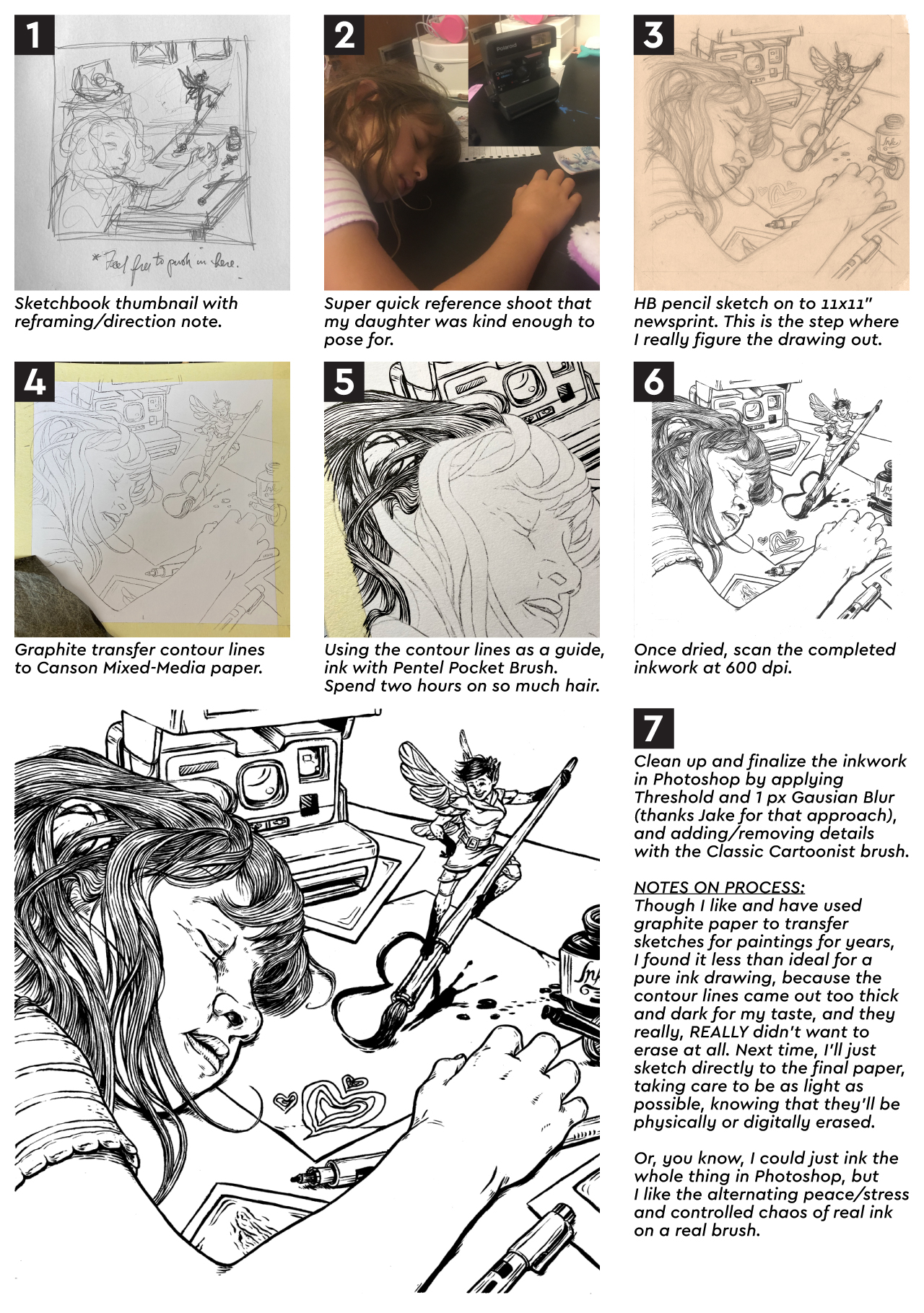
Let’s take a look at my vector illustration process using my Adventureland poster project as an example.
STEP 1: THUMBNAIL SKETCH
I created this, along with three other thumbnails for the other posters in the series, so that I could show the client my rough idea for the layout, and what elements/attractions from Disney World’s Adventureland would be featured. Pretty sure the whole set took between 10 and 15 minutes, because each design was really clear in my head. Now, when I pitched it to the client, I included a detailed explanaition of what was going on, but for my purposes, this was good enough for me.
STEP 2: FINAL SKETCH
Once my client responded back with approval, I printed out the reference images I’d googled, blocked out the frame on some 14×17″ bristol paper, and got to sketching. I feel like this sketch took somewhere between three and four hours to knockout, primarily due to the pirate ship. 1) There wasn’t a reference image from the Pirates of the Carribean ride that showed the angle that I needed for the illustration, and 2) I don’t recall ever drawing a pirate ship before. That doesn’t mean I hadn’t as a kid, but I have no memory of it. This created a fun challenge to tackle.
STEP 3: COLOR TEST
After the final sketch was completed and I’d scanned it into the computer, I created this insanely simple color sketch. I’d already pitched the color palette that I intended to use to my client when I sent over the thumbnail, but I wanted an abstract view of how the colors would work together with the Adventureland layout (for my eyes only). This is a step that I would definitely call “productive procrastination.”
STEP 4: COLORING BLOCKING
At this point, I placed the sketch on the first layer of my Illustrator artboard, set the transparency to 50% and the blending mode to Multiply, so that I could create the artwork underneath without losing my guide (which is all that the pencil sketch was ever going to be). I then pull out an extremely sophisticated tool that makes all the magic happen.
That’s right – the humble mouse. That’s all I use to create all the points and vertices needed to form the outlines of all the shapes that build up the illustration. In my mind, a stylus is for Photoshop, and the mouse is for Illustrator. They’re different programs that function very differently. It only makes sense to me to use different tools to subconsiously reinforce this as I work. Plus, in my experience, the mouse is just faster when clicking vertices out.
For this step, I’m just focused on blocking out the overall shapes and color sections of each character or element. These are also given their own layer, as to cut down on the chance that I will go insane as the illustration gets more and more complicated.
STEP 5: ADDING DETAIL
Now, I go through each big color blocked shape and drill down with more detail. Since I’m basically just tracing the pencil sketch on this step, I like to work the vector in as red or magenta lines. These colors stand out the strongest underneath the pencil lines, so I never lose track off what has and hasn’t been outlined. Also, they are exceptionally fashionable. Two birds; one stone.
Once all the red outlines are in place, I assign each outlined shape a color from the set color palette, then make sure everything is arranged from front to back in a way that will allow everything to overlap correctly (which is basically a digital version of placing colored paper cutouts over each other).
STEP 6: ADDING SHADOWS
The last step is to add the shadows (for this posterized process, I don’t add highlights in Illustrator), which is done by adding one of the darker colors over the flat color blocks at ~25% opacity on a Multiply blending mode.
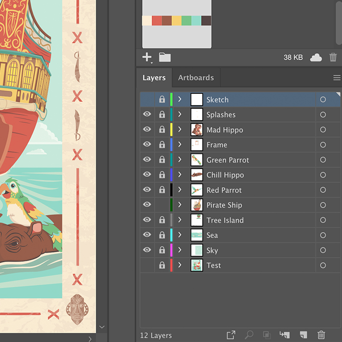
Steps 5 through 7 are done for each element in the illustration, but sometimes I do them piece by piece (for example Blocking, Adding Detail, and Adding shadows to the hippo before moving to a parrot), and sometimes I do them for the whole illustration at once. It really just depends on what rhythm feels better on that day. And, just if you’re curious, this is what all the outlined shapes on the illustration at this point in the process look like all together:
Wow. Now I understand why this (and each poster in the series) took at least 30 hours to illustrate. But, to me, it’s worth it, because everything is individually scalable and editable in a way would either be impossible or cumbersome in Photoshop. This illustration would be just as easily produced on a stamp as a building wall.
STEP 8: CREATE THE FRAME
These travel themed posters are all tied together by their frames, so on this step I designed the four tiki masks and swashbucklin’ swords, x-marks the spot graphics, and then added a weathered texture over all of it.
STEP 9: REVIEW ALL THE VECTOR WORK
This step is short and fun, the carrot at the stick of all the late nights sitting in front of the monitor wondering when I’ll let myself go to sleep… or if I will ever see sleep again. Once everything is “done” in illustrator, I turn all the layers off, then add them back in back-to-front, and watch the illustration come together. It’s at this point where I give myself one last chance to to see if I’ve missed anything, if I want to move anything, or if there’s anything else I want to add.
Personally, I find it hypnotic, especially considering it’s usually 1 a.m. whenever I find myself at a finishing point. Somehow it always works out that way.
STEP 10: FINISH OFF IN PHOTOSHOP
Now, this isn’t a step that I do for most vector work, but for these travel posters (for which I’m intentionally going for a retro, screenprinted look) and a couple of my Flat Pops, I do drop the finished vector art into Photoshop. All I do is grab an old-school grainy brush and lightly reinforce some of the shadows with some texture, to get a little bit of a spatter/half tone look.
WRAPPING UP
Projects vary in complexity, but I invariably do steps 2, 4-7, and 9 for all of my vector work. It’s challenging and fun, but by the time I finished this set of posters (the last two of which still are waiting to be released), I feel like I may have pushed Illustrator as far as I can for the sort of work that I make. This leaves me two paths: to go backwards into more simplified or abstract vector work, or to start working more in Photoshop. And the answer to that, I feel, is yes.
Both.
Oh, and if you want to buy a tee or tank top with the Adventureland print on it, you can pick it up at Nick & Lete.
PROJECT UPDATE
Well, seeing as I just spent this weekend mostly sleeping to recover from full-time homeschooling/working from home, I don’t have a ton of update at present.
I’m running an Instagram promotion for my emergency coloring pages (found here) because I want as many kids and parents as possible to have as many resources as possible to get through this pandemic shut down. So far, 63 people have downloaded the PDF, and that makes me happier than all the shirts I’ve sold on TeePublic to date. I’ll have that PDF available for download until everyone in America is able to go back to school and work.
For fun, and to get myself in the graphic novel mindset (besides all the Batman I’ve read in the past couple weeks), I’m going to put something together for a mini-challenge on the SVS Forums. A blank comic page (with the panels, of course) has been posted, and you come up with whatever story you want. Should be good practice.
Tonight, once the kids are asleep, I’m jumping back onto character design for my graphic novel project that’s sat dormant for 5 years. So the iron is hot, so to speak. I’ve also planned out the month to set some time aside to get the ball rolling on my Narnia cover project and Gravity Falls character paintings. That is, unless the world goes crazier.
How’s everyone doing? Hangin’ in there? Good. Me too. Home life’s getting stressful, but that’s to be expected with the self-isolation. The kids and I did need to get out, so we went for a jog. Speaking of which, if you ever want to feel old, go jogging with a 5 year old. But for the most part, I spent this weekend attempting to recover physically and emotionally from attempting to work and homeschool full-time simultaneously, so I didn’t touch a pencil. My main take away from all this, so far, is that we weren’t made to live like this.
But hang in there. This won’t be forever.
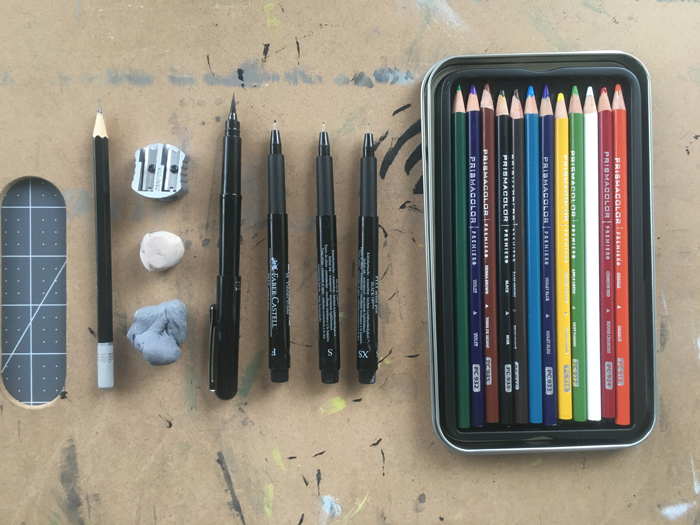
And now to the point. I’ve already written a post about how I make some of my artwork, so it only follows that I should write a on what I use to make some of my artwork. Since I consider myself more of a drawer than a painter, I’ll start with those tools.
IN-STUDIO TOOLS
I have always tried to keep my tool sets really simple and stripped down. A great deal of the creativity of art comes from the restraints you’re under (whether self-imposed or imposed by others/circumstance), not to mention, we’re just drawing here. No reason to get wasteful of cash and space. Find what works for you, and stick to that.
The tools that I use in my studio (or as my kids like to call it, the “dinner table”) are as follows:
HB Pencil. For the vast majority of my work, this is the only pencil that I use. I know a lot of artists like to use colored pencil to sketch in, but I grew up using a No. 2 for everything, and this is the closest pencil to that that has the least amount of smudging and smearing, which is important to me, as the flat of my hand has a tendancy of getting all over the place.
Pencil Sharpener. Because X-acto knives are for cutting paper and board to size. You’re not impressing anyone.
Hard white eraser. For me, this is the most successful tool for removing pencil lines, without discoloring the paper. You do, however, need to be mindful of whether there is any ink residue on there (after you’ve used it after you’ve inked a drawing), because that will smear on the paper if you’re not careful. So just keep a scrap of paper on the side where you can rub that off.
Kneaded eraser. This one’s great for just knocking some pencil work back rather than fully removing it, or for lightening a section of colored pencil for highlights. It’s also an absolute must if you’re working with charcoal.
Pens. This is the most important set of tools for drawing in my opinion. Every pen has it’s strengths and weaknesses, and which one’s you use will help to shape your style.
My workhorse is the Pentel Pocketbrush brush pen. It’s a super solid brush, is fairly easy to control while giving expression to your line work, takes replaceable ink cartridges, and I can get it at Michaels. The ink is waterproof, as long as you don’t try to drown it and give it enought time to set, so I’m able to use it with watercolors and markers. It’s awesome. I use the technical pens to suppliment the brush pen, and the brand I use for finished work is Faber-Castell, not because they’re the best (I actually like Microns better), but because their ink’s blackness most closely matches the Pocketbrush. I use an F for contour lines for inorganic props (like machinery) and sets, and S and XS for fine details and hatching (the XS specifically for hair).
The final drawing instruments that I use are Prismacolor pencils. In keeping in line with pairing things down and keeping the setup simple, I’m only working with the standard 12 pack now, and I mix my colors on paper. They also come in handy for adding detail, texture, and shading to watercolor or marker base colors.
Drawing boards. I’ve got a portable one that I can clamp paper to and work flat on the table or on my knee on the couch (pictured here), and a larger adjustable-tilt board. I only use the latter for drawings that will take multiple hours or days, because the tilted surface saves stress on my back. But if that will then need to get inked, I’ll switch it to the portable board, because I only like to ink flat.
You may have noticed something missing, and that’s a ruler. I only use rulers as a straight edge to assist me in cutting paper down to size, because I firmly believe that an artist shouldn’t need a ruler after they’ve gotten past high school art.
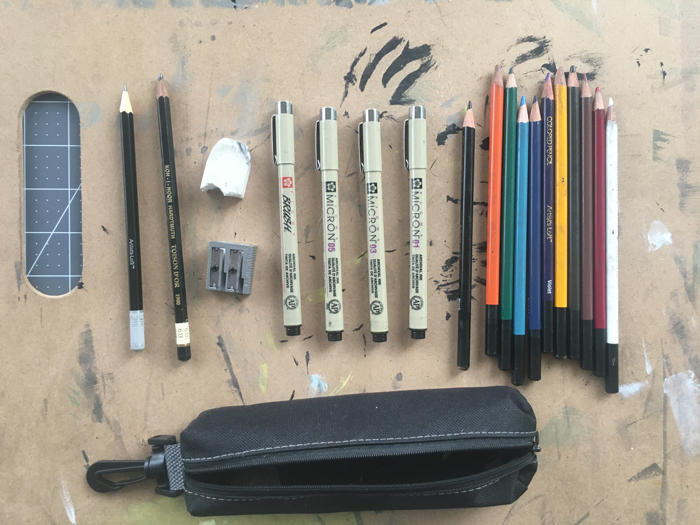
TRAVEL TOOLS
I also keep a separate, smaller set of tools bagged up if I ever want to sketch outside of the house. When doing so, I grab one of a handful of sketchbooks laying around and take these:
HB pencil. Still the main deal.
6B pencil. In case I want to top keep it just a pencil drawing, I’ve got this softer option to add value.
Hard white eraser
Pencil sharpener
Picma Micron pens. I’ve added their brushpen to the .05, .03, and .01. It’s not great, but the ink’s the same color, and anything I make with these tools I consider a sketch, so it gets the job done.
Artist’s Loft colored pencils. These are the generic brand offered at Michaels. I have much larger set if I want to do more intense coloring in my sketchbook. But for the most part, this travel set does the job just fine.
PAPER
Right now, I’m loving working with Canson’s Bristol and Mix Media papers. I use the Bristol for pencil only (including colored pencil) work, or drawings where traditional means end after inking, and the coloring/painting will be done digitally after scanning. I use the Mix Media paper when I think there may even be the possibility that I’ll want to add watercolor after inking. This is the paper that I’m using for all of my Inktober 52 animal drawings. But why 14×17 pads? Because I can easily cut it down to 11×17 or 11×14, which are standard frame sizes, which also just feel the most comfortable for me to draw on.
WRAPPING UP
That’s it. That’s all that I need to make some good drawinings. You don’t need a lot, and you can get everything you need (or at least what I need) at Michaels, and you know you’re going to get all of it at 40% off or better.
PROJECT UPDATE
To do my part in bringing a little creativity and fun into these troubled days, I’ve collected a bunch of my Solving Problems (still need a better title…) ink drawings into a print ready PDF so that kids (or you!) can print it off at home and use as coloring pages. You can download it for free here. Have fun!