Inktober 2020 Recap

Well. I’m back with a full blog.

I think everyone can agree that the last year was insane. For me, it was definitely nuts juggling full-time graphic design, pushing ahead on illustration work, and fathering a second and first grader as their never-ending Spring Break stretched into the first month of the next school year being remote as well. So, for the sake of sanity, I had to step back from writing here.

But, as I said, I’m back, and just in time to post-op how Inktober went for me last year. For those who don’t know, Inktober is a social media art challenge where the goal is to post an ink drawing every day in October, and by doing so, you improve your skills and hopefully grow your audience as an added bonus. In 2020, I wanted to do something different, so I planned to do one huge drawing with 31 characters, and post my process as I drew and inked one character a day. For multiple reasons (but mainly because I thought it would be fun), I chose to depict the Battle of Hogwarts, the magical war deciding skirmish that closes out the Harry Potter series.

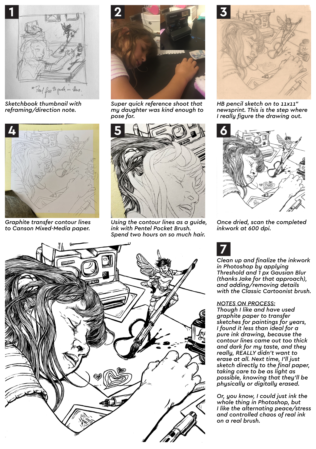
My first step was to re-listen to the audiobook. I took note of which characters were involved, where and when they were, and as many physical descriptions as I could (“which cheek of Harry’s got cut again?”). From there, I put together a list of which 31 characters could be included. Once I’d worked, and reworked, that, I grabbed a 12×24″ piece of newsprint, and drew out what was in my head as quick and ugly as I could.

Once I numbered the characters to the days that I would post them, it was time to start on the drawing. I taped a 12×24″ piece of 300 lb watercolor paper to some foamboard, grabbed a non-photo blue pencil, and started to work. Now, I’d never used this type of pencil before, but knew enough about comic book illustration and animation from the past to know that it was designed to be easily removed from inked artwork. I found that as an added bonus it worked beautifully on the watercolor paper, and fell behind the ink lines in a really appealing way, which allowed me to skip over erasing my piece day after day.

That first day was a challenge, because I chose to do Kreacher, a small elf in the front. This helped set the style and scale of the characters moving forward. However, I knew, but it wasn’t visible, that he was crouching over a casualty of the war who wouldn’t be drawn for another 19 or so days. That right there was the biggest problem to solve in the drawing – drawing in characters meant interact with other characters who were basically invisible. Of course, I told myself that I would work ahead, but that rarely happened, so the best I could do was to block in the forms of where a handful of characters would go at a time before jumping back and forth around the paper. I would work on it at night between 8:30 and 10:30 (once the kids were in bed), with the occassional early morning in the office to finish the inking on the drawing from the night before.

It was equal parts dizzying and fun, and here’s what I ended up with:

I am really happy with how it turned out, because it’s exactly what I had in my head, and I didn’t compromise on the attention to detail. You can check out the full project page here.

The biggest frustration with the project actually came from the social media side of things. About half-way through the month, Instagram apparently messed with their algorythm (or the amount of #inktober drawings just became too much to cut through), and the reach I was getting was affectively cut in half from what I had in the first week. Which is pretty messed up, since posting every day and getting audience interaction is supposed to increase exposure. Unfortunately, the opposite happened, so a lot of days it felt like I was just releasing scraps of paper into the harsh wind of the internet. Then at the very end (we’re talking about the day that I posted the final drawing of Harry), Instagram made it so that it was impossible because search recent posts for all hashtags because of garbage surrounding the U.S. Election. Now this sucked a lot. I was hoping to build my following with 100 new followers, but as October closed, I had only gained a net of 28. In the end, I was able to find a bit of follower and like redemption, but I had to use a paid Instagram advertisement to get my work in front of the people who really wanted to see it (you win again IG).

But, here’s the deal: social media is an illusion, and this project was a wonderful reminder of that. The amount of likes and follows your art generates is in no way a reflection of quality of your work. If that were the case, every anime piece would get 12 likes, instead of being inexplicably popular. In the end, I’d rather have the one person who wrote a really nice message about how much he loved this piece and how he thought it was the most impressive thing he’d seen created for Inktober that year than a few hundred anonymous likes. And hey, I even managed to sell a few of the prints, which you can get here!

Hmmm…. It’s October again in just a little more than a month. Might as well start planning for the next Inktober…

Project Updates

Seriously? Way too much has happened in the last year to give you a full rundown, so I’ll just drop in some of my favorite projects I’ve knocked out in that time. The one thing I will call out is that I signed up for and took the inaugural Children’s Book Pro course over the summer. Now, the summer is particularly tough for my schedule (without school be around to helpfully kidnap my kids every day), so I wasn’t able to get to all the assignments, but I did make it through all the lectures, and there was a lot of good stuff in there. Once we really make it into fall (instead of me just fantasizing that we’re already there), I’m going to jump back in the course work, so keep your eye out for illustated pieces from my take on Little Red Riding Hood.

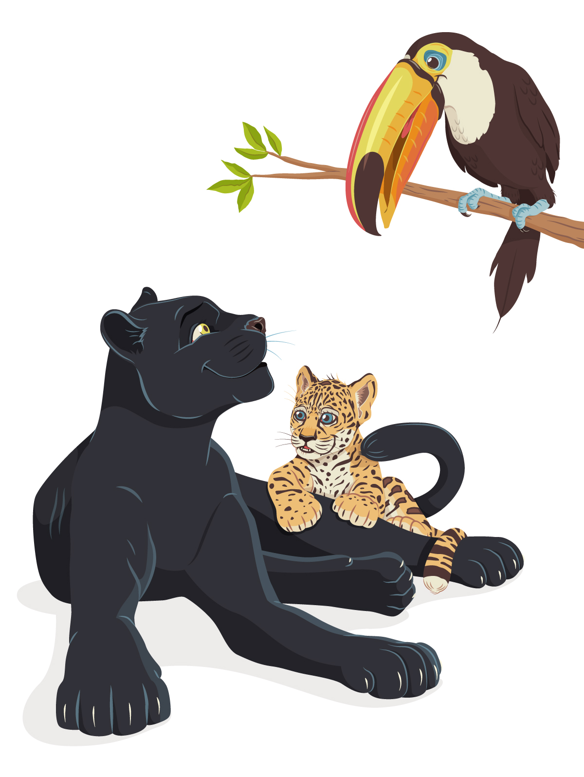
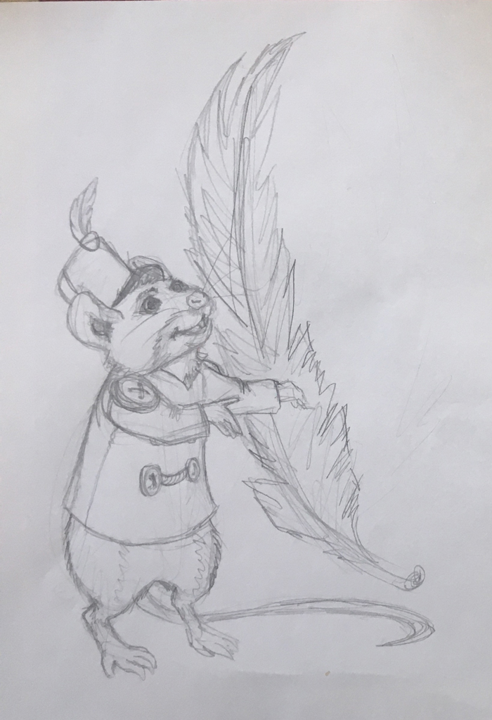
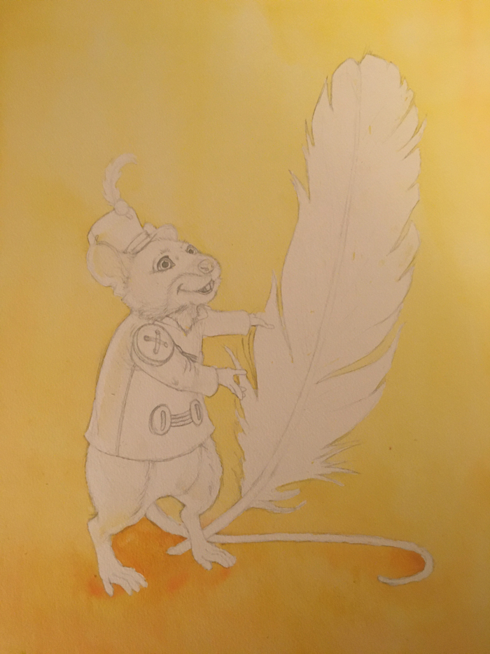
Now, let’s have some art:

Ellie and the Ink Fairy Drawing Process

Oh man. I’m alive. It’s been a crazy busy last few months, but I’m back. I’ll have a more in depth update and blog in a few days, but tonight I want to share the process steps for a new piece I just finished, “Ellie and the Ink Fairy.” I created this one for SVS Learn’s September illustration contest (rules stipulated that it needed to be black and white, and made in ink (or made to look like ink)).

At some point (hopefully soon), I’ll be adding value in Photoshop so that I’ll be able to add a grayscale image to my portfolio.

Ink and Watercolor Process

Well, that escalated quickly. Since my last post a week ago, I took my vacation to relax and work on artwork. Let’s just say that didn’t quite go how I planned. Yes, I got a lot of work done, but not everything I wanted (more on that at the end), and my relaxation started to go out the window as the Coronavirus went full pandemic on us. So now I’m looking at at least two weeks coming up of remote work for the day job, and at least the first week of them will be with the kids staying home, as their school has “extended Spring Break for another week.” Basically, my work/life balance will be severely tested (as I’m sure many of yours will), but I’ll take that over having to turn into the dad in a post-apocolyptic movie any day (I’m looking at you, Cormac). So, everyone, stay smart and safe, but don’t shut your lives down. I, for one, am going to be keeping our life as normal as possible, and I’m going to keep creating artwork and putting it out into the world, because if it can make at least one other person smile right now, it’s worth it.

This blog was originally going to be about the tools I use for each of my work processes, but that would take more prep-work that was available to me as the world caught fire, so today I’m going to break down my process for creating ink and watercolor paintings. This is my favorite way to work right now because it combines what I’m best at (drawing) with the wet medium that I’m most comfortable with (watercolors). Let’s start, shall we?

… we have to start, because I’m writing this…

Step 1: Rough Sketch

I need to make a confession: I don’t always do this step. Heck, I usually don’t do thumbnails either. I know that’s going to upset a lot of art teachers, but it’s true. Even some art teachers who I respect a lot say you should do 50 thumbnails before you move to sketches. And maybe that works for some people. My response would be, if you need to do 50 different options of a drawing, you haven’t thought about it enough yet. You jumped onto the pencil or stylus prematurely. Also, if someone can give me proof that they picked a thumbnail that wasn’t one of the first 12 they sketched, I’ll go vegan for a week. For me, I won’t do more than 3 thumbnails of a design, and I won’t do more than 2 rough sketches. I think that’s because a) I spend a lot of time thinking about a piece before I draw it (seriously, sometimes a year before I get around to some of these things), b) I went to film school, so I naturally think in terms of camera angle, staging, the rule of thirds, and dividing lines, c) and I’ve been drawing since before I could talk. Usually, when I do a rough sketch, it’s so I can tell myself I “worked” on a piece without actually working on it. It’s basically just productive procrastination, and I have a sneaky suspicion that it is for most other people with long, drawn out sketch processes.

I DID do a rough sketch of “Little White Lie” though because I had to come up with a painting in a couple days for a gallery show. This one took a couple minutes (please don’t ever spend more time than that; there’s so much else to do in life), and that’s less time than I just spent explaining why thumbnailing is usually a waste of time.

Step 2: Pencils

At this point, I grab the watercolor paper or board, an HB pencil, and get to work. Since watercolor is a transparent paint, I’ve gotta work really light at this stage because mistakes will show through. I have to remind myself of this the whole time, because I naturally press really hard with my pencil, and I think that’s because I hold my pencil weird. I hold it with my index, middle, and ring fingertips and thumb touching the pencil at all times, so there’s more muscles and articulation involved than normal. I’d like to take this moment to thank whatever teacher it was that didn’t attempt to correct me on this technique when learning to write. Whoever you are, you just might be responsible for my style, ability, and career.

Since I’ll be eventually going over this in ink, I try to only stick to the outlines of shapes and forms, but I usually add more detail, like the hair directions, to serve as a guide when I get the pen out. You’ll also notice that between the rough sketch and the final sketch, I reconsidered the shape, direction, and placement of the feather to improve the overall sense of balance. Also to make it suck less, but that’s just a gut thing, I guess.

Step 3: Masking Fluid

This is another step that doesn’t always happen, but this time it’s entirely dependent on what the painting needs. Since I knew that the background was going to be a wash, I needed to block off the subjects. Since I’m not made of money (sorry, Michaels) I only traced Timothy instead of filling him all in.

Step 4: Wash

Once the masking agent has dried, I grab the biggest, softest brush I have, water down the background, and throw a watercolor wash on there. I’m not the best at this, and am still learning to trust the paint the first time, instead of overworking it, which always causes problems (oversaturating the paper, muddying the colors, etc.). Once the wash has dried, I rub the mask off. For those of you that loved peeling dried Elmer’s glue off your fingers in elementary school, you will find this step very fulfilling. You can see that the wash bled onto Timothy a bit. I wiped if off as best as I could, but didn’t sweat it, since I knew I was going to be covering it with stronger, darker colors.

Step 5: Inking

This is the step where the real drawing is done. I do the heaving lifting with the Pentel Pocketbrush, and finer detailing with Faber-Castell Pitt pens. At this point, style happens, and I can still go off script and fix things in the drawing (like his left hand, which I changed to hold the feather, because the original position didn’t make sense in perspective).

Step 6: Paint

Then, you just kind do everything. Again, since watercolor is transparent, you work light colors to dark, which allows for the first area you painted to be dry by the time you’re done with the last area of the same base color, so you can move right into adding value and detail. Once all the values and watercolor details are in place, I grab the smallest pen I have (an XS tip), and go through and add super fine detail where I want it (whiskers, string thread). The last step is to add white highlights (beyond what’s just bare paper) with white ink.

And that’s it! You’ve got an ink and watercolor painting.

PROJECT UPDATES

  • I finished my first set of Adventure Time Flat Pops and will promote them the next time they have a sale over at TeePublic.
  • I’ve compiled the first 9 Inktober 52 drawings into a coloring book! Here’s the flip through of the mockup:
  • I scanned six of my watercolor paintings and replaced their images on this website. The colors are richer and actually resemble the physical paintings (hurray!). I’m hoping to have prints available through Society6 by Wednesday.
  • Now I gotta fry some chicken and paint this guy (in that order):

Inktober for the Year

For those who don’t know, Inktober is an annual online art challenge where, for each day of October, artists create an ink drawing. I was able to do it in 2018 and managed to do it every day… which looking back, I can’t believe actually happened. I was too busy to get to it in 2019, so I was happy to see that for 2020 there was going to be a version of Inktober that lasted all year, and there would be one prompt per week to draw towards. I started with no real plan, but by the second week, I realized that, organically, I was illustrating animals using technology to solve problems common to their species. My goal for this project is to color and collect the drawings after the year has ended into an art book.

Below are my illustrations for January:

Week 1: FlightWeek 01

Week 2: ShadowWeek 02

Week 3: BrickWeek 03

Week 4: SnakeWeek 04