We’re one week away from Easter, and I’m just starting to wrap my head around the fact that we’ll all be spending it shut off in our own homes. This morning, I ran to the grocery store and grabbed some candy, chocolate, plastic eggs, and baskets for my kids, so that the holiday can feel as normal as possible. We’ll even put on some nice pink clothes, which is weird, but all of this is weird.
Speaking of weird – my vector illustration process. So far in this blog, I’ve focused mainly on traditionally produced artwork, but I’ve been a professional graphic designer since 2008, so most of my work is actually created digitally, using Adobe Illustrator. Illustrator is fun primarily because it looks like witch-craft to anyone unfamiliar with it. I think most people can understand Photoshop in the abstract (you’re painting… but on a computer!), but creating vector artwork in Illustrator (you’re making art with points and math to insure infinite scaleability?), not so much. Which is a shame, because it’s really versatile.
Let’s take a look at my vector illustration process using my Adventureland poster project as an example.

STEP 1: THUMBNAIL SKETCH
I created this, along with three other thumbnails for the other posters in the series, so that I could show the client my rough idea for the layout, and what elements/attractions from Disney World’s Adventureland would be featured. Pretty sure the whole set took between 10 and 15 minutes, because each design was really clear in my head. Now, when I pitched it to the client, I included a detailed explanaition of what was going on, but for my purposes, this was good enough for me.

STEP 2: FINAL SKETCH
Once my client responded back with approval, I printed out the reference images I’d googled, blocked out the frame on some 14×17″ bristol paper, and got to sketching. I feel like this sketch took somewhere between three and four hours to knockout, primarily due to the pirate ship. 1) There wasn’t a reference image from the Pirates of the Carribean ride that showed the angle that I needed for the illustration, and 2) I don’t recall ever drawing a pirate ship before. That doesn’t mean I hadn’t as a kid, but I have no memory of it. This created a fun challenge to tackle.

STEP 3: COLOR TEST
After the final sketch was completed and I’d scanned it into the computer, I created this insanely simple color sketch. I’d already pitched the color palette that I intended to use to my client when I sent over the thumbnail, but I wanted an abstract view of how the colors would work together with the Adventureland layout (for my eyes only). This is a step that I would definitely call “productive procrastination.”

STEP 4: COLORING BLOCKING
At this point, I placed the sketch on the first layer of my Illustrator artboard, set the transparency to 50% and the blending mode to Multiply, so that I could create the artwork underneath without losing my guide (which is all that the pencil sketch was ever going to be). I then pull out an extremely sophisticated tool that makes all the magic happen.

That’s right – the humble mouse. That’s all I use to create all the points and vertices needed to form the outlines of all the shapes that build up the illustration. In my mind, a stylus is for Photoshop, and the mouse is for Illustrator. They’re different programs that function very differently. It only makes sense to me to use different tools to subconsiously reinforce this as I work. Plus, in my experience, the mouse is just faster when clicking vertices out.
For this step, I’m just focused on blocking out the overall shapes and color sections of each character or element. These are also given their own layer, as to cut down on the chance that I will go insane as the illustration gets more and more complicated.

STEP 5: ADDING DETAIL
Now, I go through each big color blocked shape and drill down with more detail. Since I’m basically just tracing the pencil sketch on this step, I like to work the vector in as red or magenta lines. These colors stand out the strongest underneath the pencil lines, so I never lose track off what has and hasn’t been outlined. Also, they are exceptionally fashionable. Two birds; one stone.

Once all the red outlines are in place, I assign each outlined shape a color from the set color palette, then make sure everything is arranged from front to back in a way that will allow everything to overlap correctly (which is basically a digital version of placing colored paper cutouts over each other).

STEP 6: ADDING SHADOWS
The last step is to add the shadows (for this posterized process, I don’t add highlights in Illustrator), which is done by adding one of the darker colors over the flat color blocks at ~25% opacity on a Multiply blending mode.
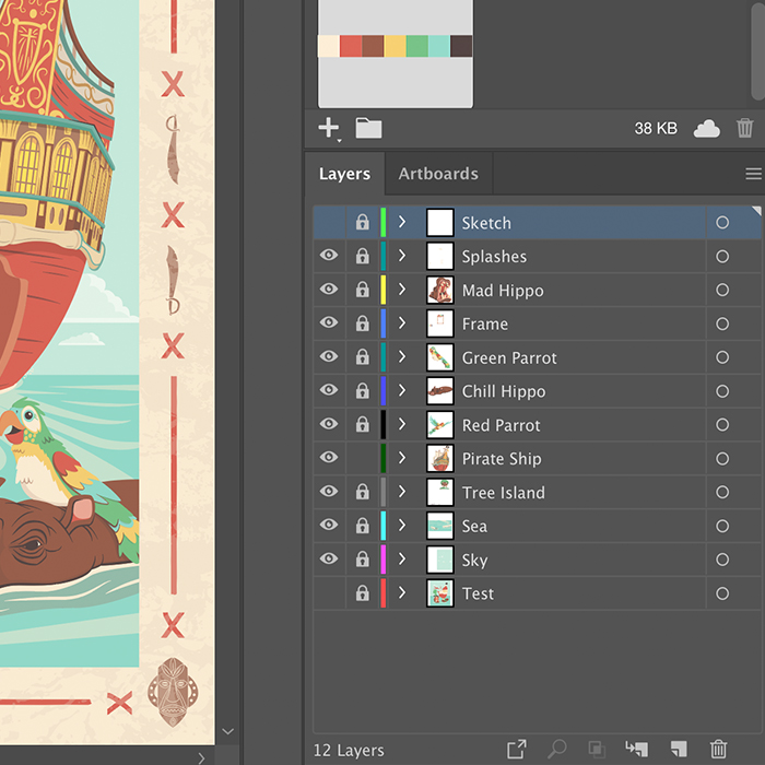
Steps 5 through 7 are done for each element in the illustration, but sometimes I do them piece by piece (for example Blocking, Adding Detail, and Adding shadows to the hippo before moving to a parrot), and sometimes I do them for the whole illustration at once. It really just depends on what rhythm feels better on that day. And, just if you’re curious, this is what all the outlined shapes on the illustration at this point in the process look like all together:

Wow. Now I understand why this (and each poster in the series) took at least 30 hours to illustrate. But, to me, it’s worth it, because everything is individually scalable and editable in a way would either be impossible or cumbersome in Photoshop. This illustration would be just as easily produced on a stamp as a building wall.

STEP 8: CREATE THE FRAME
These travel themed posters are all tied together by their frames, so on this step I designed the four tiki masks and swashbucklin’ swords, x-marks the spot graphics, and then added a weathered texture over all of it.
STEP 9: REVIEW ALL THE VECTOR WORK
This step is short and fun, the carrot at the stick of all the late nights sitting in front of the monitor wondering when I’ll let myself go to sleep… or if I will ever see sleep again. Once everything is “done” in illustrator, I turn all the layers off, then add them back in back-to-front, and watch the illustration come together. It’s at this point where I give myself one last chance to to see if I’ve missed anything, if I want to move anything, or if there’s anything else I want to add.

Personally, I find it hypnotic, especially considering it’s usually 1 a.m. whenever I find myself at a finishing point. Somehow it always works out that way.

STEP 10: FINISH OFF IN PHOTOSHOP
Now, this isn’t a step that I do for most vector work, but for these travel posters (for which I’m intentionally going for a retro, screenprinted look) and a couple of my Flat Pops, I do drop the finished vector art into Photoshop. All I do is grab an old-school grainy brush and lightly reinforce some of the shadows with some texture, to get a little bit of a spatter/half tone look.
WRAPPING UP
Projects vary in complexity, but I invariably do steps 2, 4-7, and 9 for all of my vector work. It’s challenging and fun, but by the time I finished this set of posters (the last two of which still are waiting to be released), I feel like I may have pushed Illustrator as far as I can for the sort of work that I make. This leaves me two paths: to go backwards into more simplified or abstract vector work, or to start working more in Photoshop. And the answer to that, I feel, is yes.
Both.
Oh, and if you want to buy a tee or tank top with the Adventureland print on it, you can pick it up at Nick & Lete.
PROJECT UPDATE
Well, seeing as I just spent this weekend mostly sleeping to recover from full-time homeschooling/working from home, I don’t have a ton of update at present.
- I’m running an Instagram promotion for my emergency coloring pages (found here) because I want as many kids and parents as possible to have as many resources as possible to get through this pandemic shut down. So far, 63 people have downloaded the PDF, and that makes me happier than all the shirts I’ve sold on TeePublic to date. I’ll have that PDF available for download until everyone in America is able to go back to school and work.
- For fun, and to get myself in the graphic novel mindset (besides all the Batman I’ve read in the past couple weeks), I’m going to put something together for a mini-challenge on the SVS Forums. A blank comic page (with the panels, of course) has been posted, and you come up with whatever story you want. Should be good practice.
- Tonight, once the kids are asleep, I’m jumping back onto character design for my graphic novel project that’s sat dormant for 5 years. So the iron is hot, so to speak. I’ve also planned out the month to set some time aside to get the ball rolling on my Narnia cover project and Gravity Falls character paintings. That is, unless the world goes crazier.
