I’m surprised and honored to report that I am one of TeePublic’s Featured Artists/Designers for this week! I’ve kept a shop on TeePublic for several years for apparel, stickers and swag – it’s the closest thing that I have to a “side hustle” – but since it’s not a priority for me at this stage in my career, it’s really nice to get the attention from them for my work, culminating in a solo ad on their homepage this Saturday.
I’ll be adding a new design for purchase on Wednesday, and my whole shop is on sale all week! If you’re interested in grabbing anything: TeePublic Shop
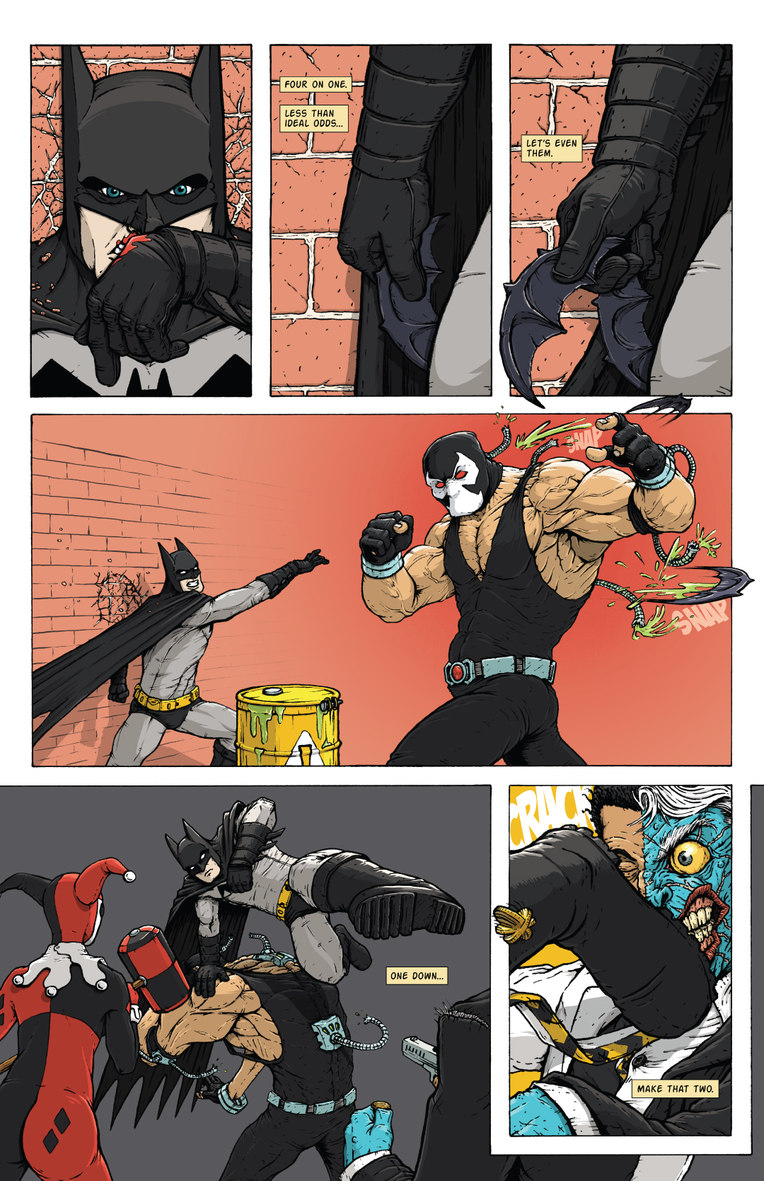
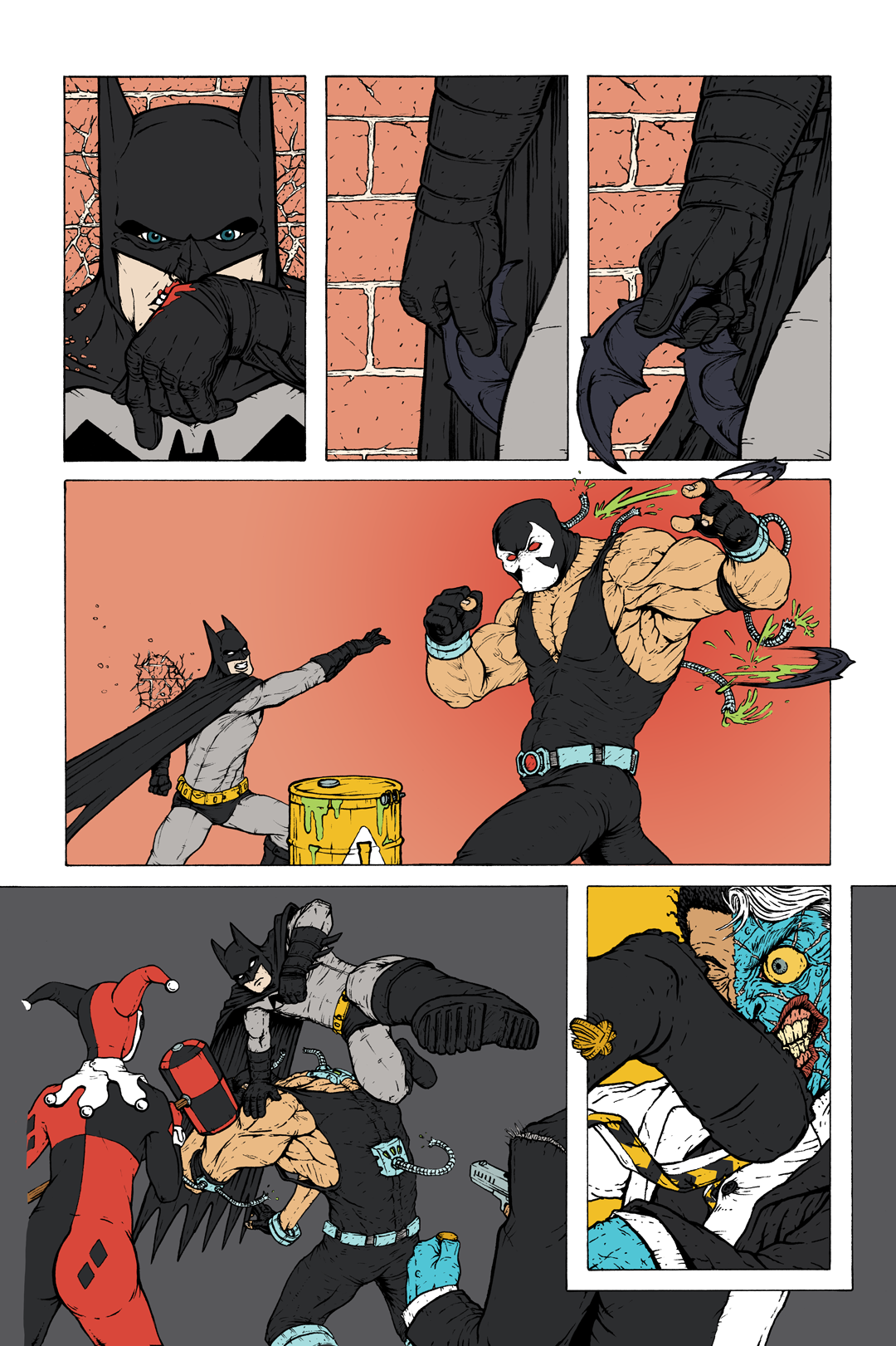
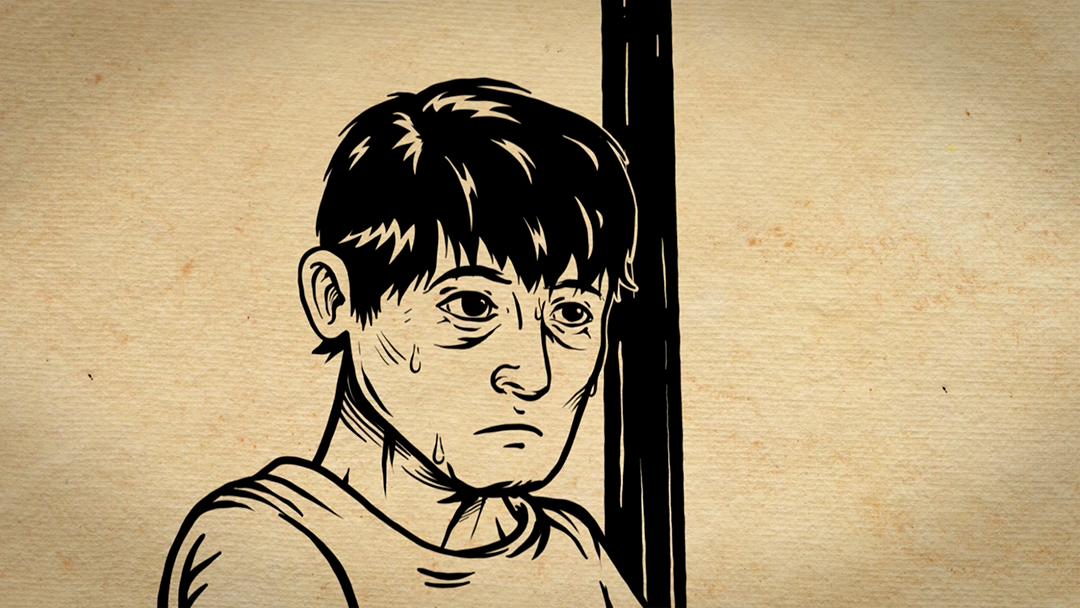
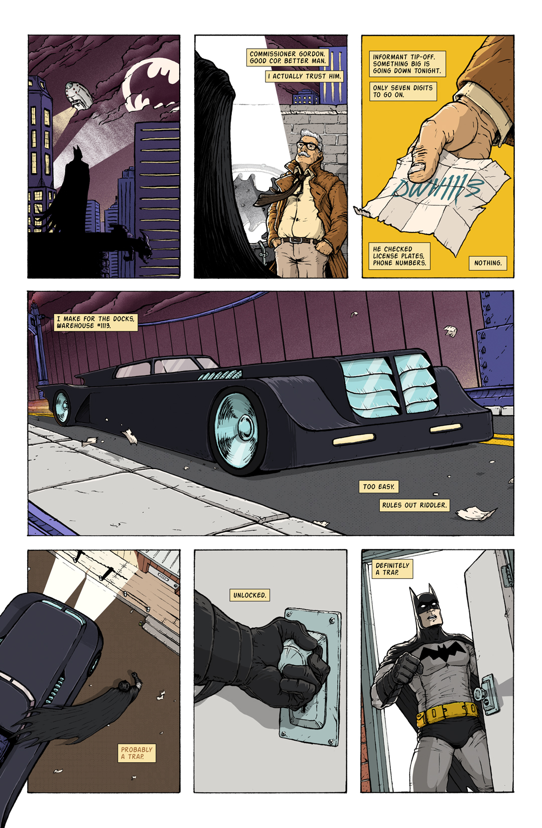
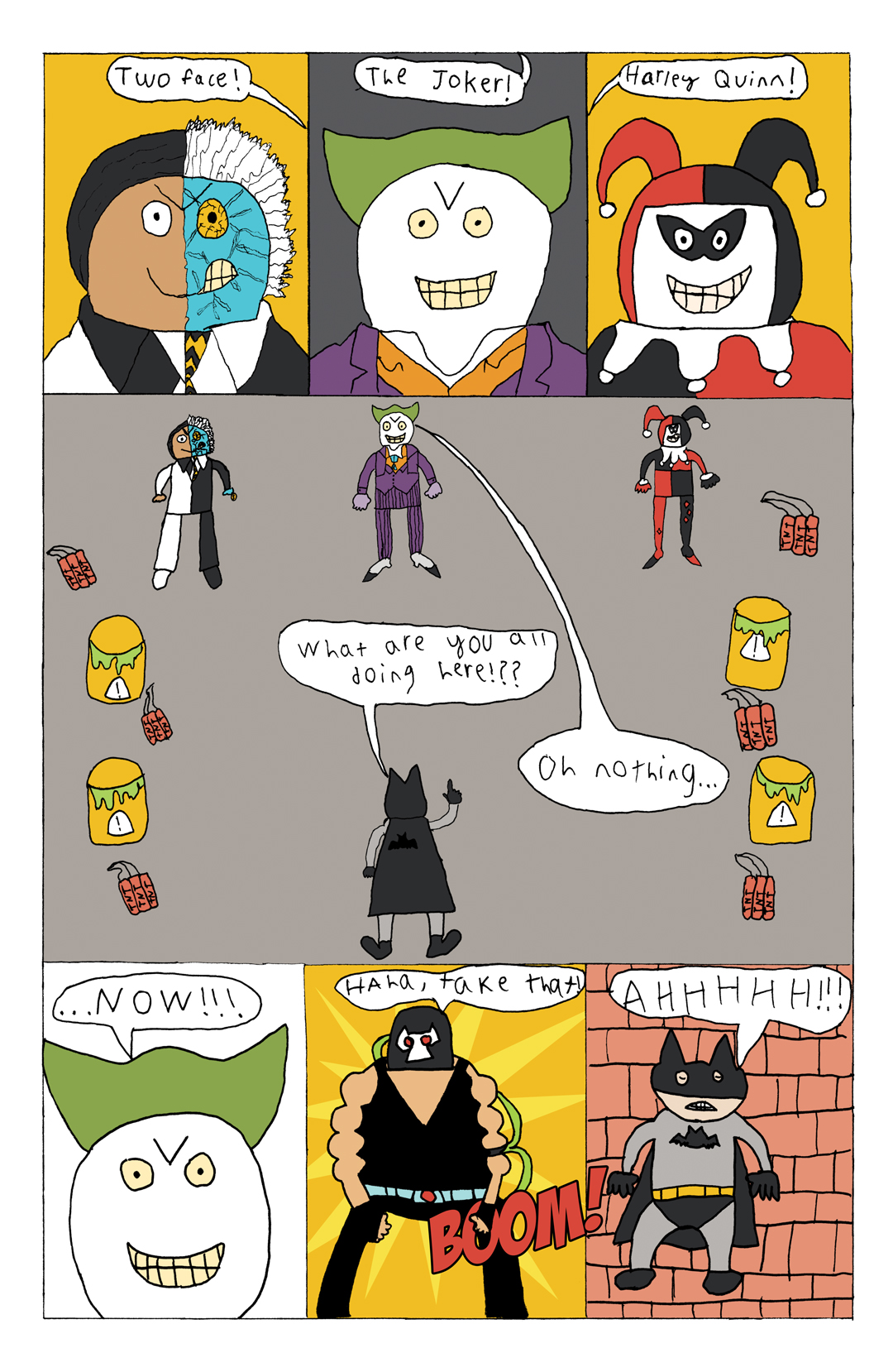
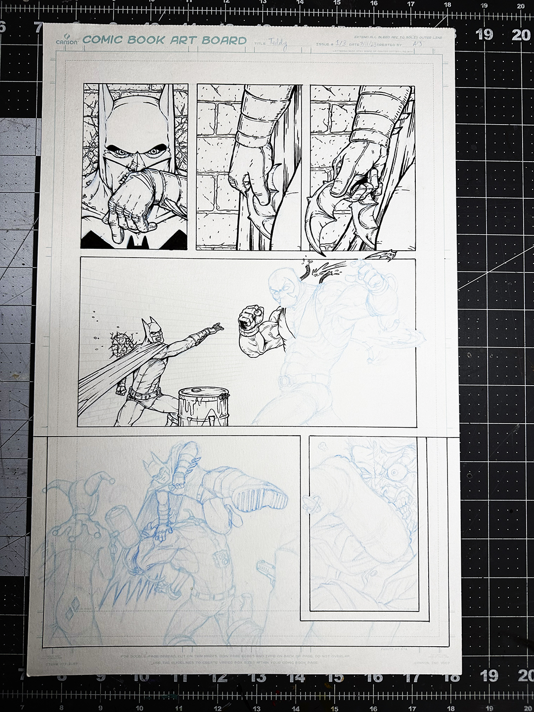
BATMAN TEAM-UP COMIC
Page 3 is done!
In the next issue, I’ll include some more details, as well as Page 4 (created by my son!).
QUICK ILLUSTRATION UPDATE
Based on how far behind I am, my projected workload for the rest of the year, and my mid-year goal re-evaluation, I’ve decided to drop taking part in the Character Design Challenge every month as a goal. If a monthly prompt really grabs me, I’ll do it, but otherwise, I need to pour all of my effort into knocking out the projects I’ve already got piled up on my plate.
— Andrew
PS: Don’t forget to follow me on following socials:
Super short update today! I’ve made it through a family staycation, vacation, and Independence Day Weekend, and found just enough time to finish laying in the flat colors for the 3rd page of the Batman comic I’m making with my son:
Now that I’ve got some free time (especially with my kids out and about for most of the rest of the summer), I’m looking forward to going full time into Halloween project production – starting by finishing off a painting that’s been taunting me for at least a year.
— Andrew
PS: Don’t forget to follow me on following socials:
And I thought April was a blur… Turns out that animated project I was working on ended up consuming my life (work and personal) for about 3 weeks. Then,on the morning I delivered it to the client, I jumped on a plane (with 1.5 hours of sleep) and was out of town on a business trip for a week.
Poof. There went May.
Painful, but definitely a learning experience. For example:
I learned that I have 3 gears. I can continue to work ridiculously hard for a ridiculous amount of time, pushing through exhaustion levels for about a week to a week and a half, but then my body has to crash and get a full night’s sleep before starting the process again.
It’s absolutely not worth it. After spending pretty much the last month of the school year (the last year of elementary for my boys) not seeing my family outside of meal times (3 of those weeks with me actually being home, just locked in my home office), it was glaringly clear to me that better scheduling, planning, and client communication would have been way more effective. Extended crunch times do not work for a family man. I’ve worked pretty hard to get better at time and project management on the personal level – now I just need to force those healthy habits and boundaries into my professional life. Fingers crossed.
That being said, I’m extremely happy with the end product (and so was the client). Here’s the completed animation from my favorite sequence of the project:
COMIC PROJECTS UPDATE
That big animation project derailed my project calendar so thoroughly that the only way to get things back on track is to reschedule some projects. And the bigger the project, the bigger the delay.
Unfortunately, this means that I’ll need to push production on “Jupiter IX” to January 2025. This, of course, sucks, but is the right thing to do. It’s waited this long, so I’m not going to try to jam it into an unrealistic timeline. Plus, this will give my schedule the air to finish my Batman project with my son at a really high level, without having to drop any of the other great smaller projects I have lined up for the back half of 2024. He’s grown so much as an artist since finishing his last page – I’m extremely excited to see what comes next!
ILLUSTRATION UPDATE
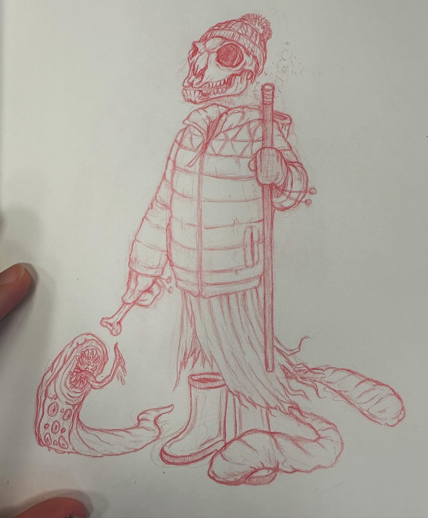
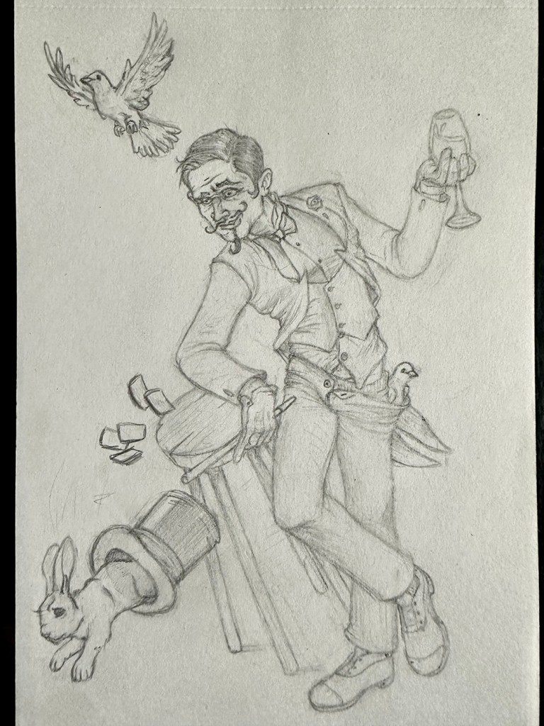
I’m officially behind being behind on the Character Design Challenges. However, I did find the time to knock out my character sketch for the April theme, “Traveling Shepherd”:
This is more of an update on the Illustration/Art World at large, but since the last issue, pretty much everyone has lost all patience with Meta. This is because that company (which includes Facebook and Instagram) has decided that they have the right to train their proprietary AI on the artwork uploaded by users. Now, I definitely think that’s unethical, but I guess they technically have the right to do so on their platform, as long as they provide a way for artists to opt out of that feature. However, they’ve made it close to impossible for artists (especially in America) to opt out, so many have looked for an alternative. This includes me, but mostly because Instagram has stopped being in any way beneficial to me for at least a year.
This brings us to Cara, a new portfolio/social site for artists that is strongly anti-AI. I’ve set up an account there, and would really appreciate it if you are able to give me a follow: https://cara.app/ajillustrates
Time to get back on track! I’ll be using to June to finish a painting and making progress on my Gandalf sculpt, and to take a much needed staycation with my wife and kids. Can’t wait to spend more time with the work I care most about, and with the people that matter the most to me.
— Andrew
PS: Don’t forget to follow me on following socials:
April was an absolute blur. We’re in the busy season at my day job as a Creative Director, with multiple huge projects going on, and biggest of all, for me at least, is a new “sketch” animation project. This one’s a two minute video for an organization battling homelessness in New York, and the art direction is roughly “wood block illustrations of river-rafter within a Lewis & Clark era map” (because nothing can ever be easy, and I wouldn’t want it any other way). One of the fun wrinkles that I’ve cooked up for this one is to start with live-action shots of hands (my totally model-worthy hands) holding the map, and then we dive into it for nearly the full length of the video before pulling back out for logo and CTA recognition.
Here are some of my favorite screenshots so far:
ONGOING PROJECTS
BATMAN TEAM-UP COMIC
The inks are done for Page 3! I’ve still got some things to clean up digitally, but overally, I feel this is a big improvement on my previous page. I still don’t feel confident with the finality of laying in blacks, but I did push them a little bit with Bane.
So far, 3 out of the first 4 pages are complete, with cleanup and coloring my second page being my top priority this month. This has been my favorite project to work on for a long time, and I am loving seeing my son’s creativity grow!
The Character Design Challenge for March was “Animal Wuxia Warrior,” so I used that as an excuse to draw a version of the Grim Reaper that I’ve had in my head for the Land of the Dead. My Lord of Death is a cross between an angel and a raven, whose cloak morphs into black, feathered wings when he needs to fly. Whenever I get to a proper illustration of him, I’m looking forward to rendering his black armor, flecked and lined in gold.
My wife and I celebrated our 2nd Wedding Anniversary this month! Since the gift theme is “cotton,” and she loves hanging out at home in big, comfy sweatshirts, I decided to design her a college-style sweatshirt for her Hogwarts House, Slytherin (and, yes, all of this is exactly as geeky as it sounds).
Though her sweatshirt is one of a kind, you can snag apparel with my basilisk illustration at TeePublic.
By the next issue, I should be wrapped on the animation project, and I’ll be my creative energy and time will be freed up again to spread it around to my ongoing personal illustration and sculpture projects. See you then!
— Andrew
PS: Don’t forget to follow me on following socials:
I feel like I say this every year, but 2023 has to have been the fastest year ever. And not even in a “time is relative” kind of way, but more of a “hey, when did days start having 18 hours in them instead of 24” kind of way. Whatever the case (Science? The earth’s rotation? Trying to do too many things at once?), my 2023 was absolutely all over the place, to the point where I missed out on contributing to this blog after last January.
I mean to correct this oversight. I’ve spent the first 3 months of 2024 really focusing on time management and habit tracking, and I think I’ve gotten myself back into a good enough schedule that it’s time to get back to writing. So, let’s look at this post as sort of a soft reboot of the blog, and make it issue number 1 of “Monday Morning Illustrator.” Starting today, I’ll be posting a blog filled with project updates, both big and small, every other Monday. I’m shifting the focus of my art career onto larger projects, so this blog will be used primarily to document the progress I make as a chip away at some big things.
But first…
2023 REVIEW…
…In Illustration:
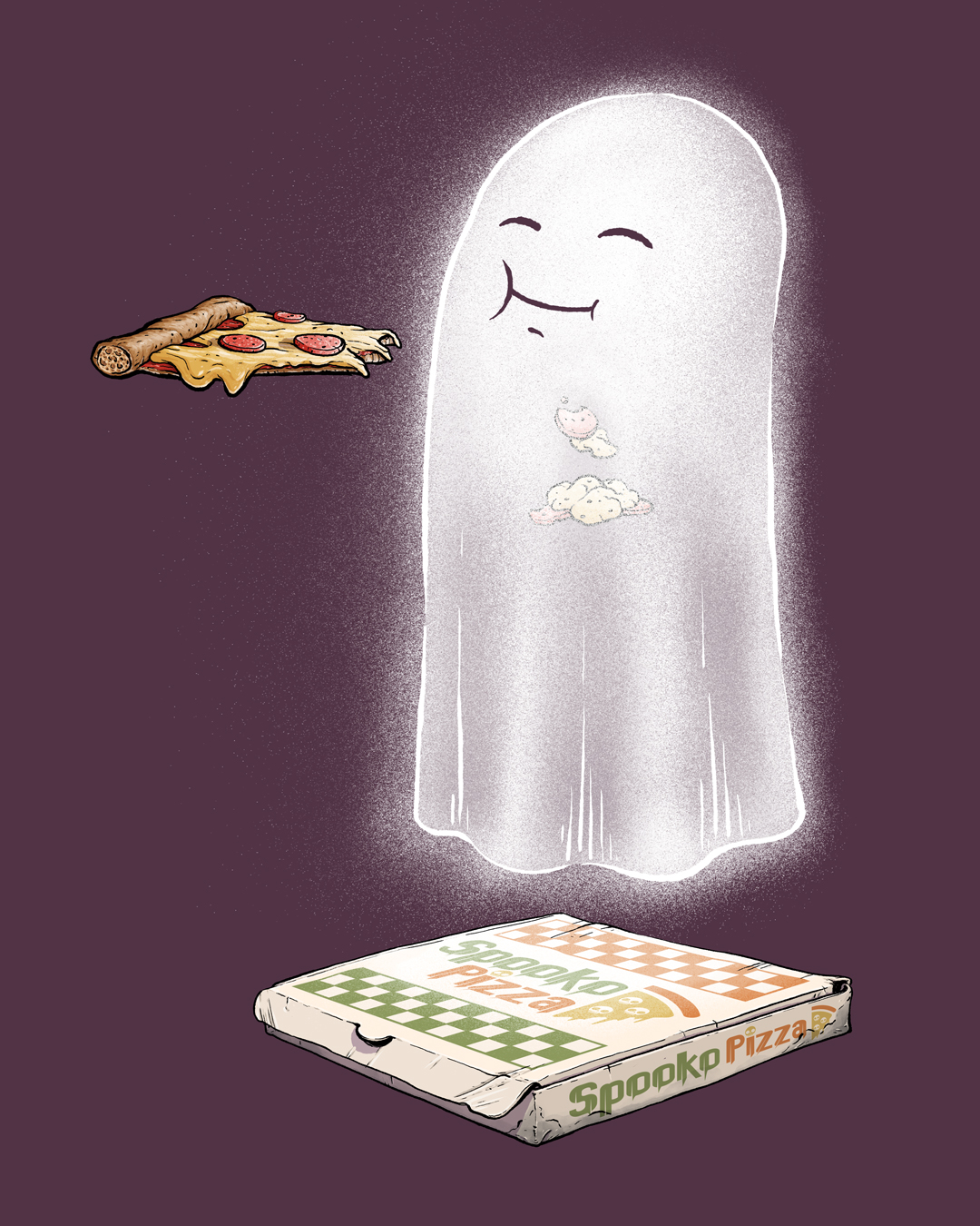
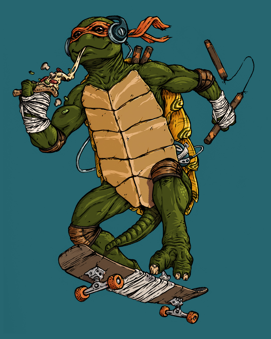
Hold the Cheese | Bad Apple #12GimliBowserPizza GhostMichelangelo
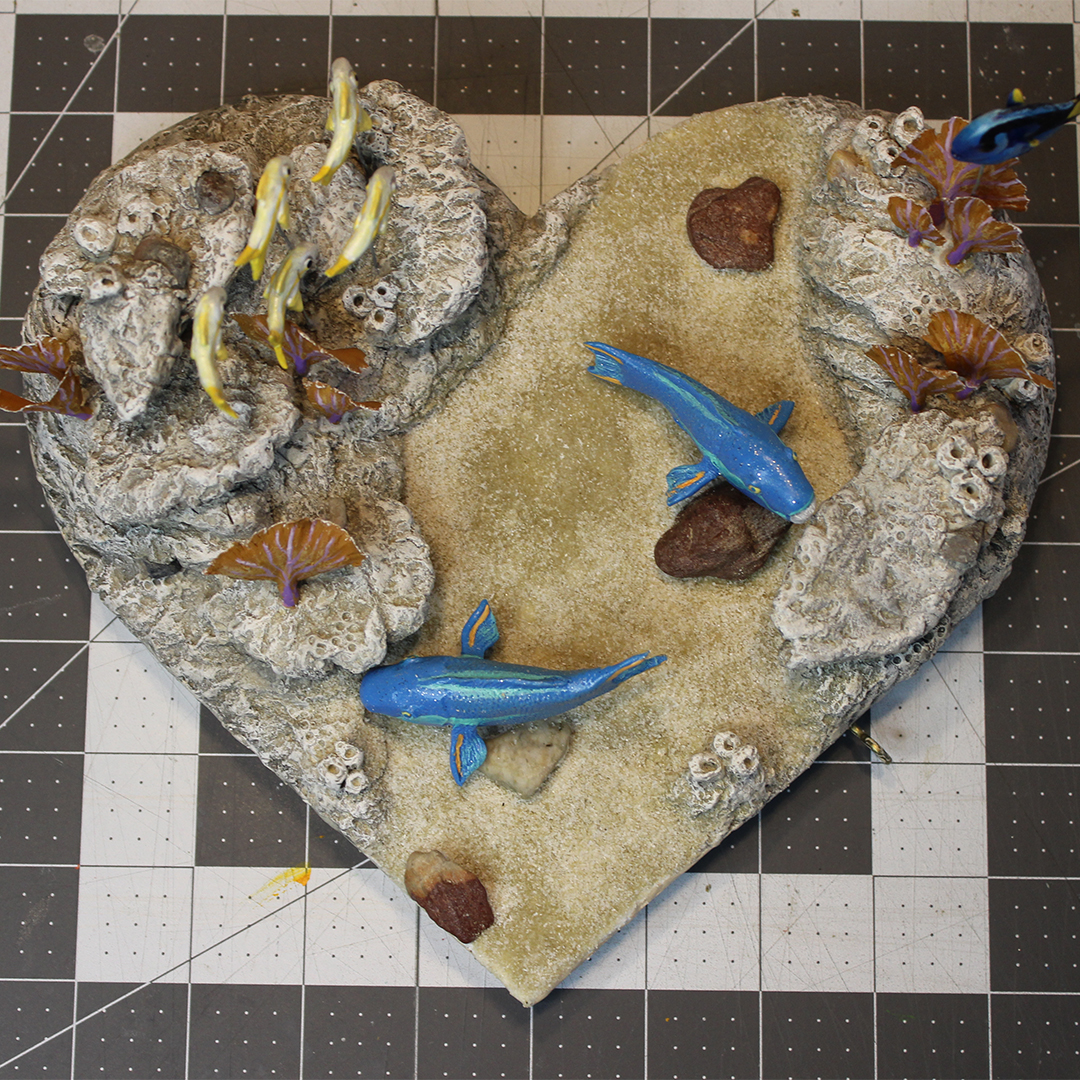
… in Sculpture:
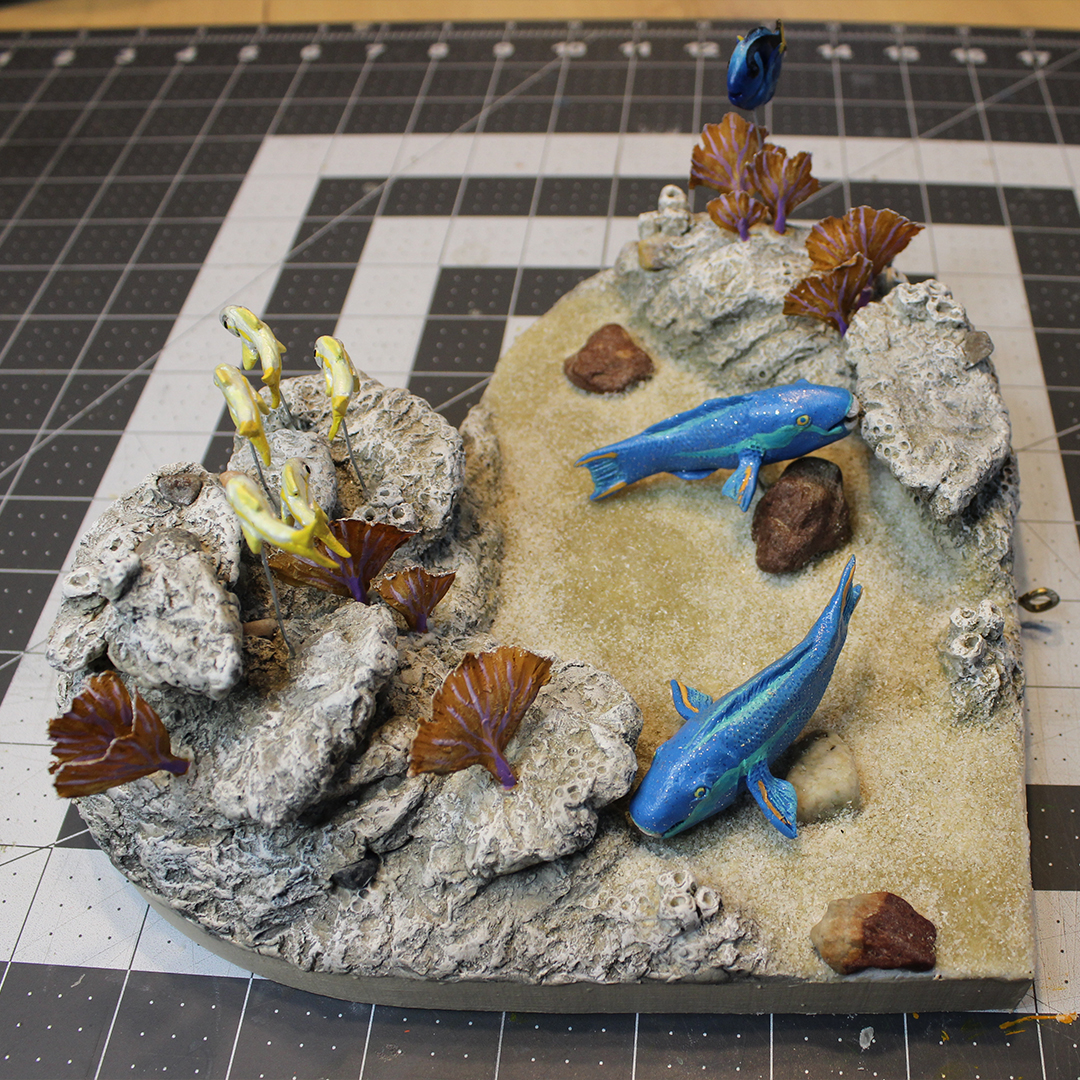
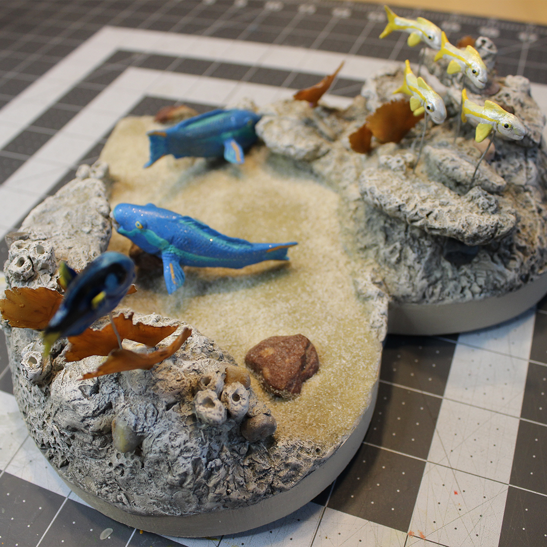
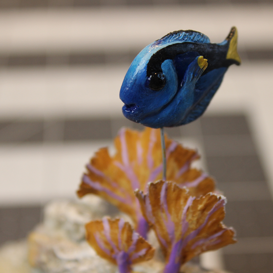
For my wife’s 2023 valentine, I recreated our honeymoon snorkling trip at the coral reef off the coast of Key West.
… and in the Sketchbook:
Oh, and I also won some industry awards for animation. Two Communicator Awards of Excellence (Animation and Causes & Awareness), and one Silver Telly (Series: Animation). It’s always nice to have your work recognized, especially when it’s with a great team and for great clients. To date, I’m up to 5 Communicators and 4 Tellys, and I’m about to start work on a brand new animated video that I think has a shot for one in the future.
BIG PROJECTS
BATMAN TEAM-UP COMIC
Starting last summer, my son (10 years old at the time) and I decided that we wanted to collaborate on a fun project together. We quickly landed on the idea of making a bootleg, 8-page Batman comic. Each of us would be responsible for writing, penciling, inking, and lettering 4 pages (I took on the colorist job for all pages), making the story up as we went, handing off alternating pages.
Page 1 by Andrew JohnsonPage 2 by Theodore Johnson
So far, 3 out of the first 4 pages are complete, with cleanup and coloring my second page being my top priority this month. This has been my favorite project to work on for a long time, and I am loving seeing my son’s creativity grow!
Aside from being a blast to work on, the Batman project is also a warm-up for me as I slide into original comics creation. I’ve had an idea since at least 2009 for a science fiction story, and this summer I’m finally ready to begin production on the first chapter of what I hope will be a ~250 page graphic novel. So far, I’ve thumbnailed out that chapter (titled “Jupiter IX,” named after the space station at the heart of the action), and have begun to revisit the character designs.
In June, I’ll start ramping up toward production on that comic, so be on the lookout for this blog to launch as a newsletter in the summer that will track its development.
Outside of the big narrative projects, I want to keep myself on my toes with smaller art pieces. I’ve actually booked myself up on these throughout year, because I had so many projects that I wanted to jump onto last year, but ran out of time. Here’s how things are looking so far:
ILLUSTRATION UPDATE
One of my goals is to draw every day, and to do so, I’m making sure that I at least always have something to work on in my sketchbook. I’ll be using the monthly themes for the Character Design Challenge as inspiration throughout the year.
For January, I created a Death Rider for my Land of the Dead (“Dragon Postal Service” theme).
And for February, I put our family’s dog Kevin in a mech-suit to create a police K-9 unit for the world of Jupiter IX.
Broken Up About It | Bad Apple #13
As always, I took part in the For the Love of Kettle art exhibition/fundraiser for the Kettle Art Gallery in Dallas, Texas. This marks the 13th painting in my Bad Apples series. I’m not sure if I’m going to continue creating them for this event, of if I want to go into a different direction for 2025.
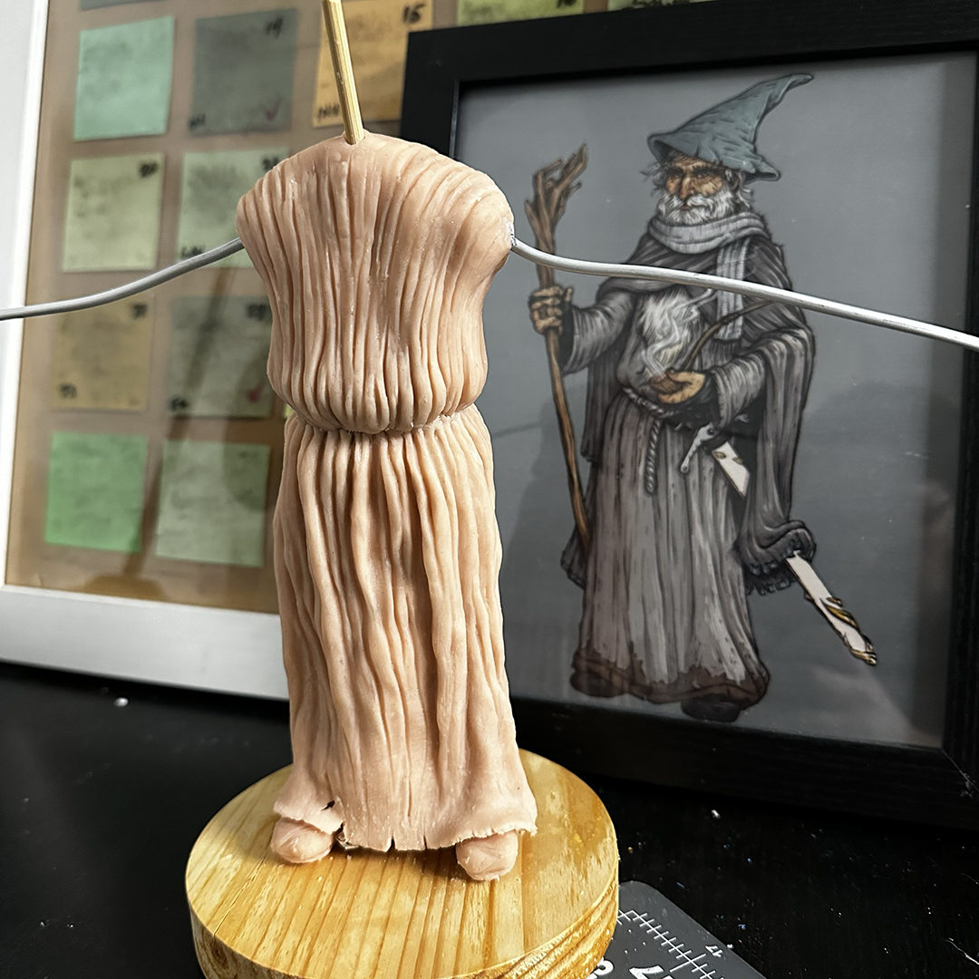
In January, I returned to a sculpt of Gandalf that had been sitting untouched in my closet for about a year and a half. I’m really enjoying working on it, and just got in some Cosclay to try out for the first time on it (so I can make flexible belts, hair, and fabric). Unfortunately, with everything else I’m working on, this one’s gotta be the palate-cleansing project that I’ll only be able to squeeze in an odd day here and there between bigger projects.
I try to make every valentine sculpt for my wife special, but this one definitely hits for me. It commemorates the first painting that she ever sold (from the 2023 For the Love of Kettle event), which was inspired by the storm of emotions after being laid off (along with all the other women from her department). Now that our family’s on the other side of that, I wanted to create an homage to that painting to celebrate her strength and spirit. Fun note: an empty high-heel is WAY harder to sculpt for me than a hand. That thing was for real the devil.
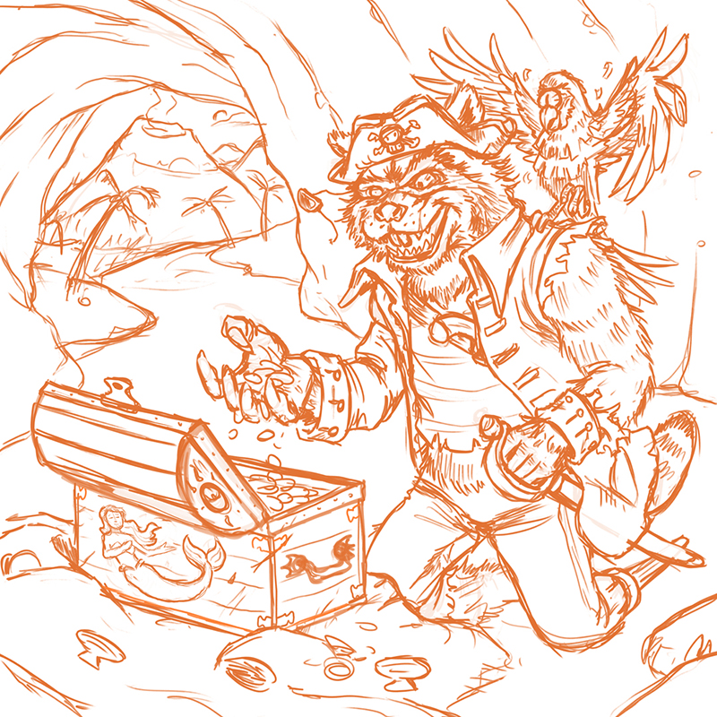
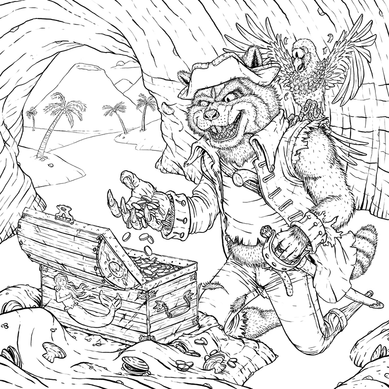
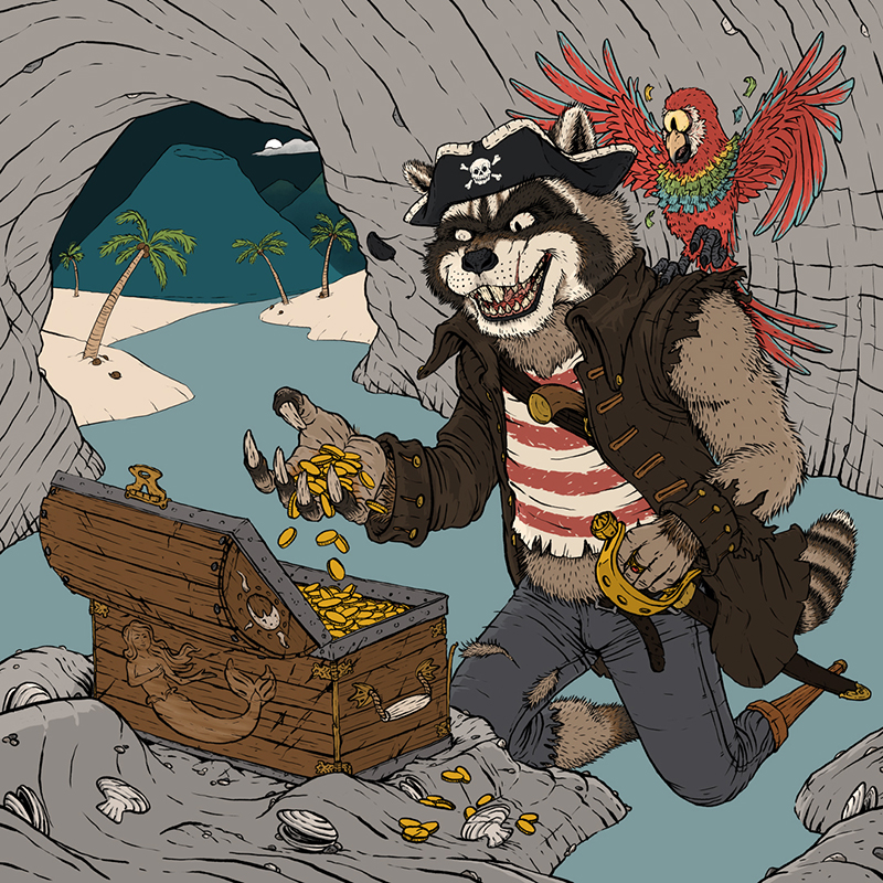
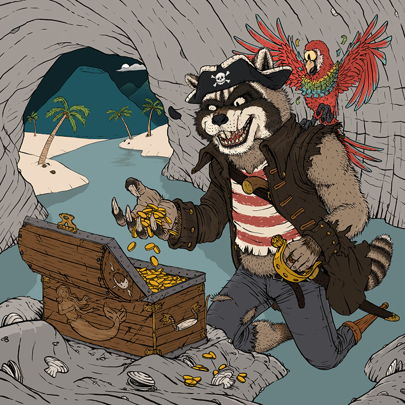
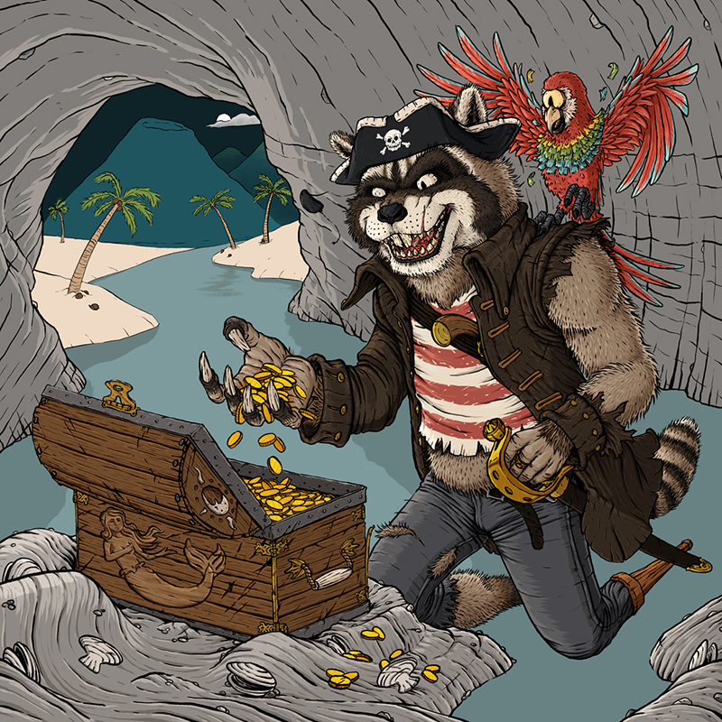
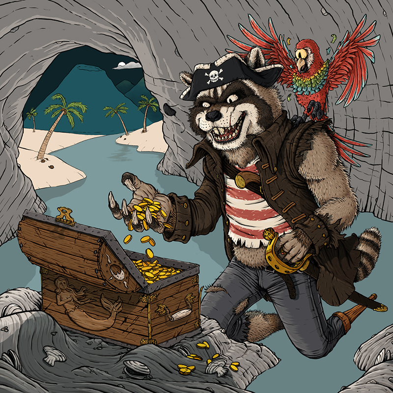
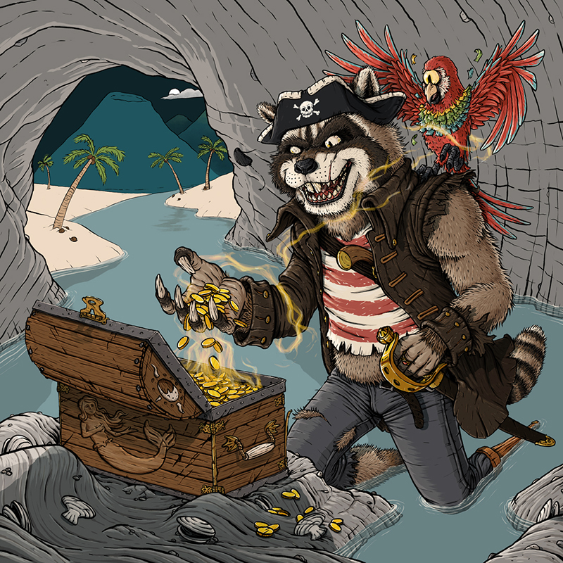
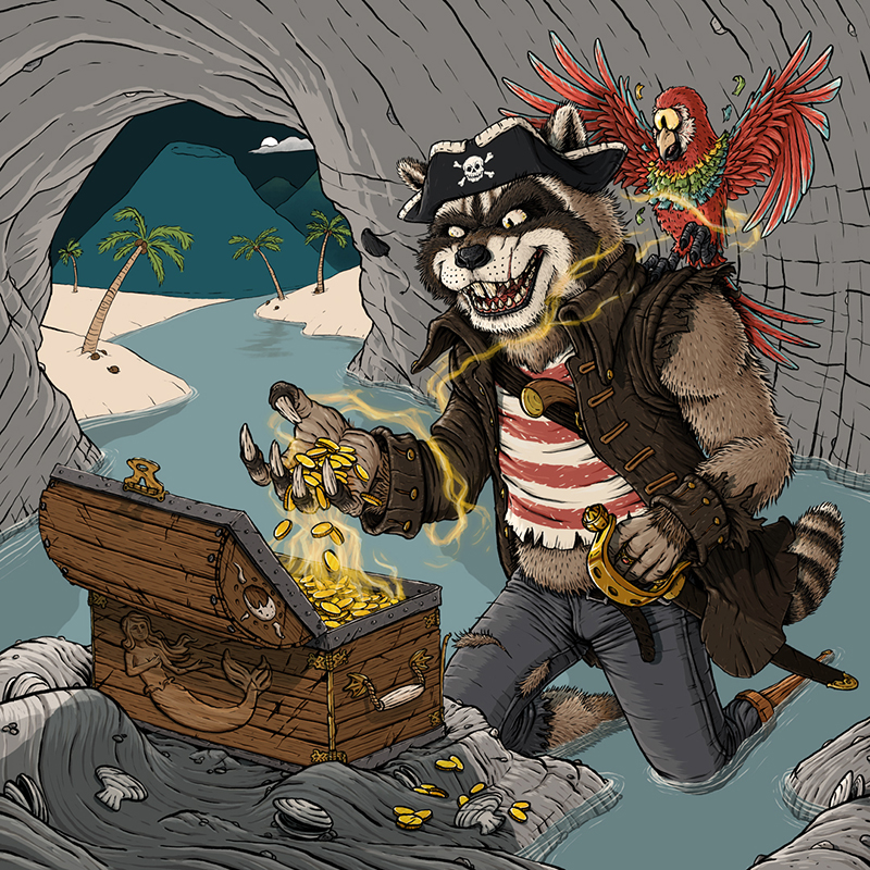
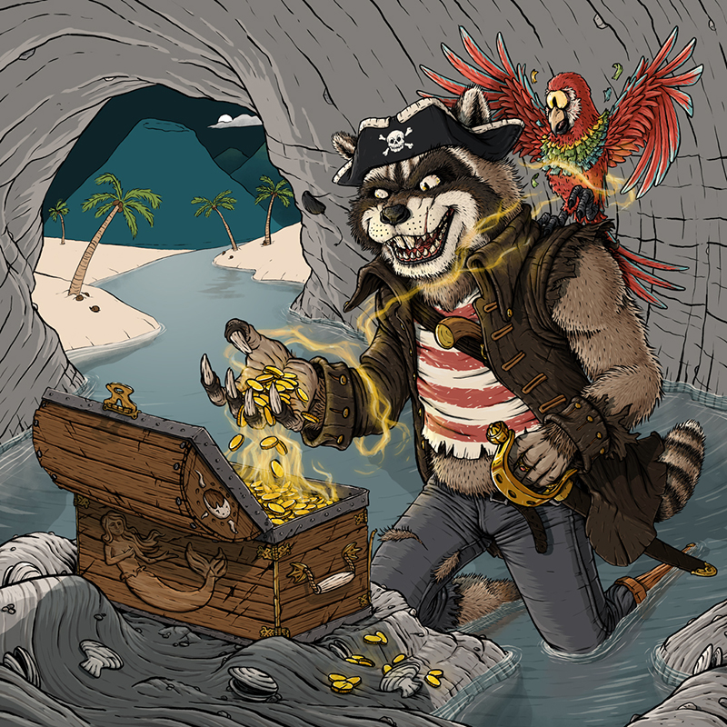
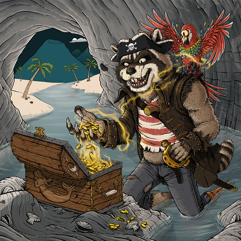
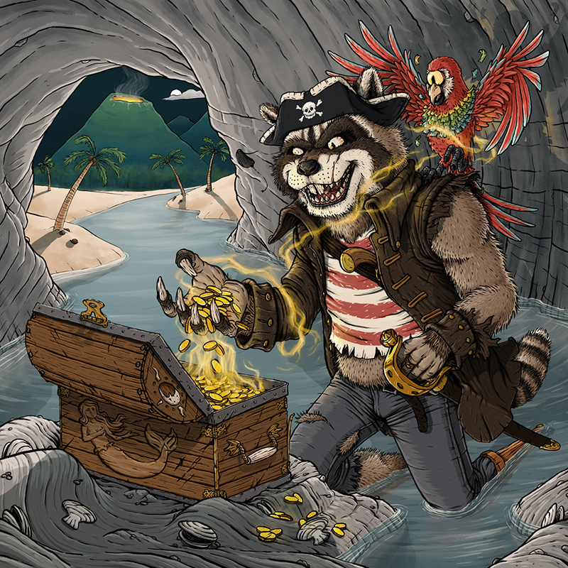
For this week’s blog (a week late due to family stuff and the subject of this blog taking way too long, but I’m getting ahead of myself), I’ll be taking a deep dive into my latest completed piece, “Curse of the Mermaid Gold.” Below I’ll be walking though my digital painting process in nearly complete detail (some layers have been combined into one step for clarity’s sake, and the order has been fudged slightly to make more sense). Even though I made this piece entirely for fun, this is the same layer of detail and effort I put into my professional work as well, because if something’s worth doing, it’s worth spending 40 hours on stretched over 13 days and countless uncounted minutes fretting over how much cave floor water is the right amount of cave floor water while making dinner or walking on a treadmill, staring 1,000 miles into the distance.
THE DRAWING PHASE
1 – Rough Sketch: Since this might be the first fully fleshed out piece I’ve created completely digitally, I started out by quickly scribbling my idea into Photoshop. I did put a 3×3 grid over to guide me, making sure that imported components roughly lined up with the rule of thirds, because design is really just Math + Taste.
2 – Final Sketch: After the quick, mad ravings were completed, I lowered their opacity and drew the final sketch over it. I’ve spent the last few years working hard to work less hard on this phase, and working digitally definitely helps speed things up considerably. Basically, the goal hear is to give it the same quality and detail in the drawing as if 14 year old Andrew did it, just with less teenage angst, depression, and inexplicable shyness.
Oh, and I’ve been asked quite a few times recently why I usually sketch in reds and oranges. This is because ink lines stand out really well over them. Also, it just looks “dope.”
3 – Ink Lines: Here’s where the real work happens. The quality of the sketch can be sophmoric (which I drop the opacity on and work over) because I go HARD with ink. I taught myself to draw as a kid from comic books, so I see my main style as an attempt to both replicate and elevate that. Basically, deep down, I’d probably rather be drawing the X-Men at any given time…
Anyway, I used the Classic Cartoonist brush to do all of this, because it can perfectly replicate my real world brush pen work without the constant possibility that I could ruin the entire piece at any given moment.
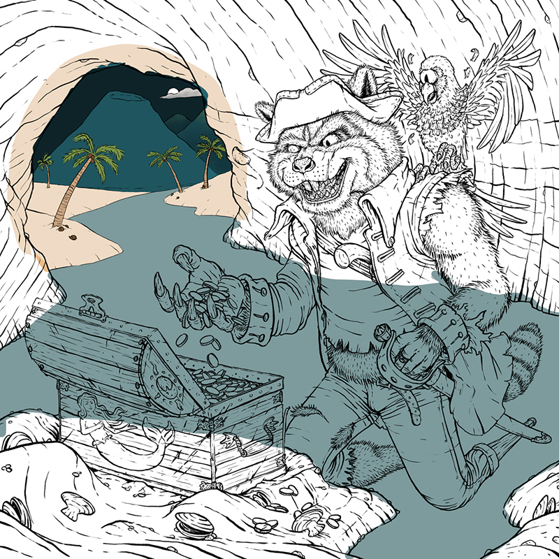
COLOR BLOCKING PHASE
4 – Background Color Blocks: At this point, I start color blocking, putting in all the base colors that I’ll be building on top of. I think of my process from here on as either a boomerang or bell curve, because I start from the back and least important parts of the piece, work my way to the front and focal points, spend most of my time there, and then work my way back to back before finishing everything off.
I start every digital piece with the same color palette, and then mix from their to get the right tints and shades. I do this partly because I like those colors (I feel they’re very end of summer/early fall in their purest form), partly because it brings cohesion to all of my work, and partly because it saves me time, which is great, beause this is the phase that feels the most like work.
Fun Note: You can see where I screwed up much later in the process and painted on the deepter mountains and the cloud in this layer instead of the correct one.
5 – Water Color Blocks
6 – Cave Color Blocks: This one was actually pretty tricky getting the cave to a good color that wouldn’t blend in with fur coming up right n-
7 – Character Color Blocks: As many times as I keep swearing off fur and feathers, I keep going right back to them in my work. Must just be a gluton for punishment?
8 – Foreground Color Blocks
THROWING SHADE PHASE
9 – In the Shade: Since I chose to do a 2.5 light source lighting approach, I needed to put darken up areas that weren’t touched by the moonlight.
10 – Water Shade
11 – Cave Shade
CHARACTER/FOREGROUND VALUES AND LIGHTING PHASE
12 – Darker Values: At this point, I start adding the darker values to principle charactera and the foreground. A lot of professionals and art teachers will call this “adding value” and scoff at you if you call it “shading,” but that’s just semantic, patronizing nonsense, because “shading” is exactly what you’re doing. So, as far as I’m concerned, call it whatever you want; we all know what you’re talking about, because it’s all just “lighting” anyway. Because I come from a Film background, I like to separate it out like you would onset, lighting the characters, foreground, and background independently. I’m going for cinematic rather than naturalistic.
13 – Lighter Values: Here’s where the shapes get to start taking form, and I can finally start enjoying looking at my work.
14 – Shadows
15 – Shadows in Shadows: Since we’re not in an extremely dark setting (it is a full moon after all, and all that water is going to be bouncing that atmospheric lighting all over the place, we can’t forget that objects within a cast shadow will still cast their own shadows.
16 – Highlights
17 – Hotspots: This is the only stage where I’ll allow myself to use pure (think titanium) white (my palette starts with something like an egg shell insteadd), because that stuff is addictive, and once you start with it, it’s next to impossible to put it down. It’s basically the Oreos of art.
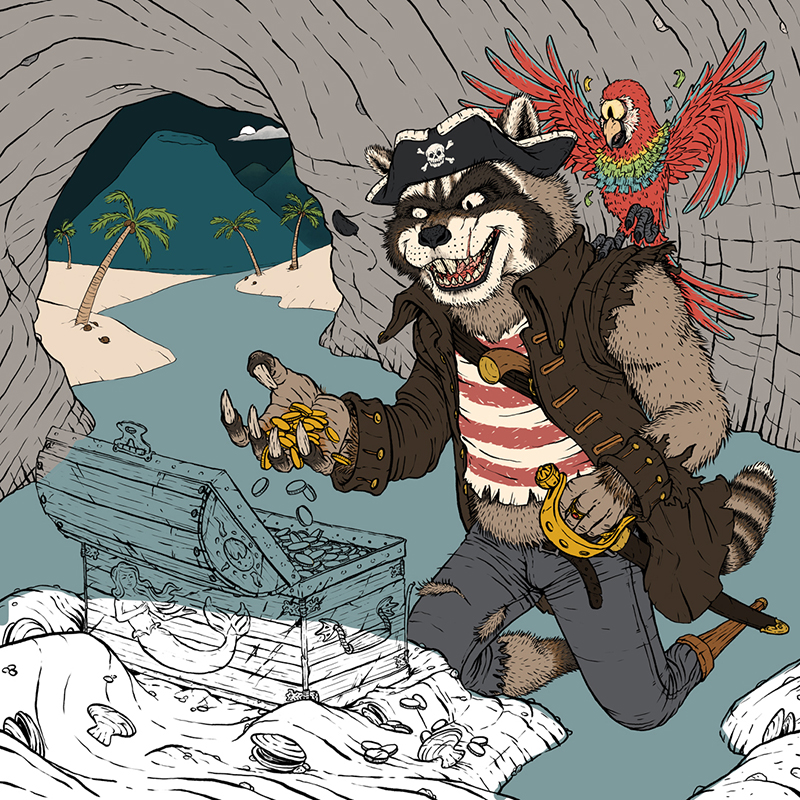
EFFECTS PHASE
18 – Tide: This was a good reminder that no one knows what’s in your head but you. Since I knew that the captain here was going to be kneeling in several inches of water, it didn’t bother me that it looked like he was hovering over the cave floor. Everyone else? Not so much.
19 – Ripples: Always fun. I think Bob Ross was at his happiest while slapping some ripples onto his canvas with a palette knife.
20 – Arm Extra Shade: His left arm, with all that fur popping out of the leather jacket, was really bothering me, so I doubled up it’s shade quotient to get it in line.
21 – Magic: Is he being curse right now, having just transformed? Or is the magic about to tranform him back after he’s returned the gold? That’s for the fan to decide, having left it intentionally up for interpretation. But just like Christopher Nolan, I’ve left at least one clue to let you know what I know is really happening. P.S. The author/director/artist always knows the answer. If they say otherwise, they’re lying.
22 – Stronger Magic: Had to add a couple more layers to both beef up the tendrills wrapping around the capatain, and brighten up the tendrills reaching out of the chest.
23 – Glow: Congratulations! We’re halfway done. But seriously, if you’re still hanging in there, thank you.
24 – Stronger Glow: Same with the magic, an extra layer was needed to help separate things without being in your face like an anime. And we never want to be like anime. Never.
WATER DETAIL PHASE
25 – Floor Darker Values: At this point in the project, I was ready for it to be over, so it was great that I left all background and painterly stuff left to finish.
26. Floor Lighter Values
27. Shadows in Water: At this stage I got to start tying the characters and setting together.
28. Reflections: I didn’t want thsese to be too exact, but to be just enough to trick your eye into believeing you’re seeing the reflections that it’s been trained to expect.
29 – Water Gradient: This was subtle, but really helps sell that the lighting conditions shift once you enter the cave.
30 – Water Texture
31 – Wave Highlights: Part of me wonders if I should have brightened these up closer to the volcano, but I didn’t want to draw too much attention to them. So I probably made the right choice, but that doesn’t mean that I won’t think it over every time I look at it.
CAVE DETAIL PHASE
32 – Cave Lighter Values: Just some rim lighting for the moonlight.
33 – Cave Painting: As we’re getting farther into the background, I was able to knockout adding texture and darker values all at the same time.
34 – Cave Shadow: I was going to leave this detail out of the piece, but my wife insisted it was a good idea. She was totally right, and that admission should bank me some good will ahead of the next artistic disagreement.
35. Cave Glow
36 – Stronger Cave Glow
BACKGROUND PAINTING AND FINISH TOUCHES PHASE
37 – Background Shadows: We’re in the home stretch now!
38. Background Paint
39. Volcano
39 – Stronger Volcano: Because if you’re going to put a volcano in the background, it might as well be about to erupt.
41 – Deep Background Texture: Things were looking too smooth back there, so I multiplied some watercolor painting texture over it to grunge things up a bit.
42 – Smoke: Just to top off the volcano properly.
43 – Blue Overlay: I added this to push the background more into a moonlit temperature and to be able to have the glowing volcano without (hopefully) unnecessary complaints that I have too many focal points in the piece.
44 – Water Color Paper Texture Underneath: I don’t like my work to look too digital, so usually will incorporate some paper texture into the piece. A wise man doesn’t build his house on the sand, and a wise artist doesn’t paint on 100% white. So, I grouped all the artwork layers together, set them to multiply, and through some watercolor paper beneath everything. Unfortunately, this pushed everything a little too dark for my liking…
45 – Final Texture and Saturation: …so I screened the watercolor paper over the whole painting, finishing everything off with a saturation layer to put the colors back where I want them to be.
And that’s it! Just 45 easy steps to create a were-raccoon pirate captain and his cycloptic pinata-parrot being cursed by mermaid gold. Now, I’ve got another Monster Bash party planned to go down during Spring Break – should I create something else in this world, or come up with something completely different, but equally weird?
Let me know in the comments, and smash that like butto- nah, just kidding. But thanks for reading. I’m hoping to go into some similar Deep Dives on a couple other projects this year, but in totally different styles and mediums.
PROJECT UPDATES
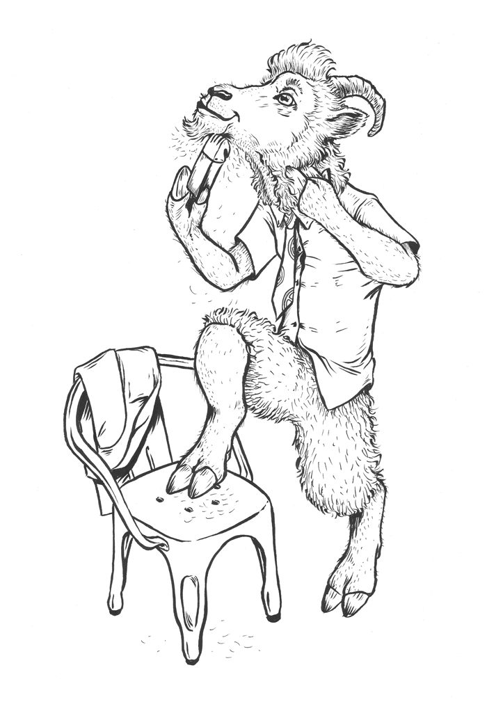
In the last update, I said that I should have another Year of the Ring character sketched and inked. I missed the mark on that one:
However, I was able to complete the sketching on Quickbeam (because Treebeard gets enough love already). Just need to add a couple short passengers, and it’s ready to ink.
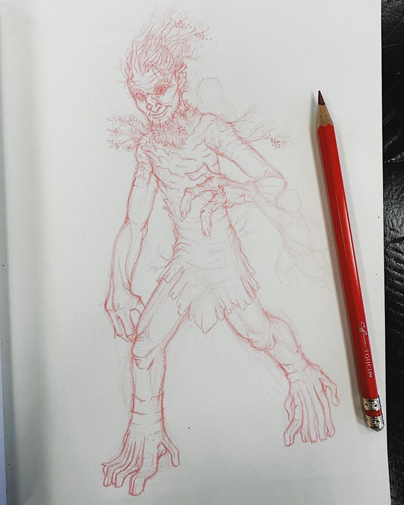
The reason I didn’t finish Quickbeam was because I got distracted by this sketch of Wolverine.
See? There really is always a part of me that would rather be drawing the X-Men.
I think everyone can agree that the last year was insane. For me, it was definitely nuts juggling full-time graphic design, pushing ahead on illustration work, and fathering a second and first grader as their never-ending Spring Break stretched into the first month of the next school year being remote as well. So, for the sake of sanity, I had to step back from writing here.
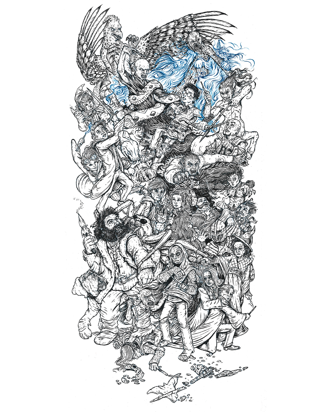
But, as I said, I’m back, and just in time to post-op how Inktober went for me last year. For those who don’t know, Inktober is a social media art challenge where the goal is to post an ink drawing every day in October, and by doing so, you improve your skills and hopefully grow your audience as an added bonus. In 2020, I wanted to do something different, so I planned to do one huge drawing with 31 characters, and post my process as I drew and inked one character a day. For multiple reasons (but mainly because I thought it would be fun), I chose to depict the Battle of Hogwarts, the magical war deciding skirmish that closes out the Harry Potter series.
My first step was to re-listen to the audiobook. I took note of which characters were involved, where and when they were, and as many physical descriptions as I could (“which cheek of Harry’s got cut again?”). From there, I put together a list of which 31 characters could be included. Once I’d worked, and reworked, that, I grabbed a 12×24″ piece of newsprint, and drew out what was in my head as quick and ugly as I could.
Once I numbered the characters to the days that I would post them, it was time to start on the drawing. I taped a 12×24″ piece of 300 lb watercolor paper to some foamboard, grabbed a non-photo blue pencil, and started to work. Now, I’d never used this type of pencil before, but knew enough about comic book illustration and animation from the past to know that it was designed to be easily removed from inked artwork. I found that as an added bonus it worked beautifully on the watercolor paper, and fell behind the ink lines in a really appealing way, which allowed me to skip over erasing my piece day after day.
That first day was a challenge, because I chose to do Kreacher, a small elf in the front. This helped set the style and scale of the characters moving forward. However, I knew, but it wasn’t visible, that he was crouching over a casualty of the war who wouldn’t be drawn for another 19 or so days. That right there was the biggest problem to solve in the drawing – drawing in characters meant interact with other characters who were basically invisible. Of course, I told myself that I would work ahead, but that rarely happened, so the best I could do was to block in the forms of where a handful of characters would go at a time before jumping back and forth around the paper. I would work on it at night between 8:30 and 10:30 (once the kids were in bed), with the occassional early morning in the office to finish the inking on the drawing from the night before.
It was equal parts dizzying and fun, and here’s what I ended up with:
I am really happy with how it turned out, because it’s exactly what I had in my head, and I didn’t compromise on the attention to detail. You can check out the full project page here.
The biggest frustration with the project actually came from the social media side of things. About half-way through the month, Instagram apparently messed with their algorythm (or the amount of #inktober drawings just became too much to cut through), and the reach I was getting was affectively cut in half from what I had in the first week. Which is pretty messed up, since posting every day and getting audience interaction is supposed to increase exposure. Unfortunately, the opposite happened, so a lot of days it felt like I was just releasing scraps of paper into the harsh wind of the internet. Then at the very end (we’re talking about the day that I posted the final drawing of Harry), Instagram made it so that it was impossible because search recent posts for all hashtags because of garbage surrounding the U.S. Election. Now this sucked a lot. I was hoping to build my following with 100 new followers, but as October closed, I had only gained a net of 28. In the end, I was able to find a bit of follower and like redemption, but I had to use a paid Instagram advertisement to get my work in front of the people who really wanted to see it (you win again IG).
But, here’s the deal: social media is an illusion, and this project was a wonderful reminder of that. The amount of likes and follows your art generates is in no way a reflection of quality of your work. If that were the case, every anime piece would get 12 likes, instead of being inexplicably popular. In the end, I’d rather have the one person who wrote a really nice message about how much he loved this piece and how he thought it was the most impressive thing he’d seen created for Inktober that year than a few hundred anonymous likes. And hey, I even managed to sell a few of the prints, which you can get here!
Hmmm…. It’s October again in just a little more than a month. Might as well start planning for the next Inktober…
Project Updates
Seriously? Way too much has happened in the last year to give you a full rundown, so I’ll just drop in some of my favorite projects I’ve knocked out in that time. The one thing I will call out is that I signed up for and took the inaugural Children’s Book Pro course over the summer. Now, the summer is particularly tough for my schedule (without school be around to helpfully kidnap my kids every day), so I wasn’t able to get to all the assignments, but I did make it through all the lectures, and there was a lot of good stuff in there. Once we really make it into fall (instead of me just fantasizing that we’re already there), I’m going to jump back in the course work, so keep your eye out for illustated pieces from my take on Little Red Riding Hood.
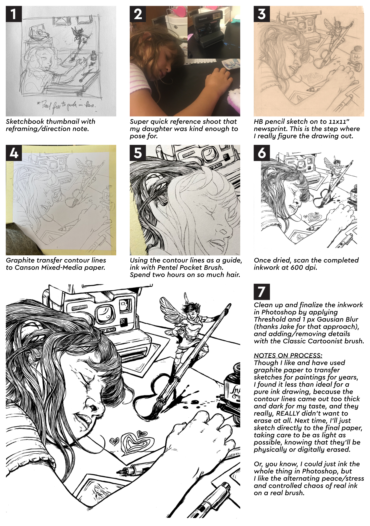
Oh man. I’m alive. It’s been a crazy busy last few months, but I’m back. I’ll have a more in depth update and blog in a few days, but tonight I want to share the process steps for a new piece I just finished, “Ellie and the Ink Fairy.” I created this one for SVS Learn’s September illustration contest (rules stipulated that it needed to be black and white, and made in ink (or made to look like ink)).
At some point (hopefully soon), I’ll be adding value in Photoshop so that I’ll be able to add a grayscale image to my portfolio.
Long time no post. After my last writing, stress just kinda built due to the virus lockdown, and it knocked me sideways. Isolating and staying at home, turns out, is EXTREMELY not good for young kids. Really, it’s not good for anyone, but especially 7 and 5 year olds. So some shifts in classwork and work-work scheduling needed to be figured out, and my brother and sister-in-law stepped up to help the three of us get some space and time apart. All that added up to me basically losing any steam to draw or paint in early April. The good news is that hitting that snag really underscored a big mental/emotional/spiritual need for me:
I NEED ARTISTIC COMMUNITY.
This has always been a problem for me. I’ve always been the art guy. I was drawing before I could talk, I was always the best artist every step of the way from kindergarten through high school, and even in college all my roommates were computer science or software engineering majors. Basically, I’ve always been doing this alone.
And that sucks. It’s exhausting. And it’s lonely. And that sure wasn’t going to get any easier in a global pandemic, because there was no way to find an art community (outside of the SVS forum that I take part in). So, the only option was to take the bull by the horns and create one. I knew that my buddy Ben from work had been getting into oil painting over the last year, so I pitched the idea of creating an art group with the goal of encouraging, critiquing, and holding each other accountable to keep working on our projects. He was in, and we then invited another friend from work, Jason, to join in. He had never painted before, and wasn’t sure of his artistic prospects, but was looking for a new hobby to pass some of this downtime. Each time our group meets, we’re all tasked with sharing updates on what we’ve worked on, what we’re working on now/next, and what skill we’re focusing on improving with our current projects.
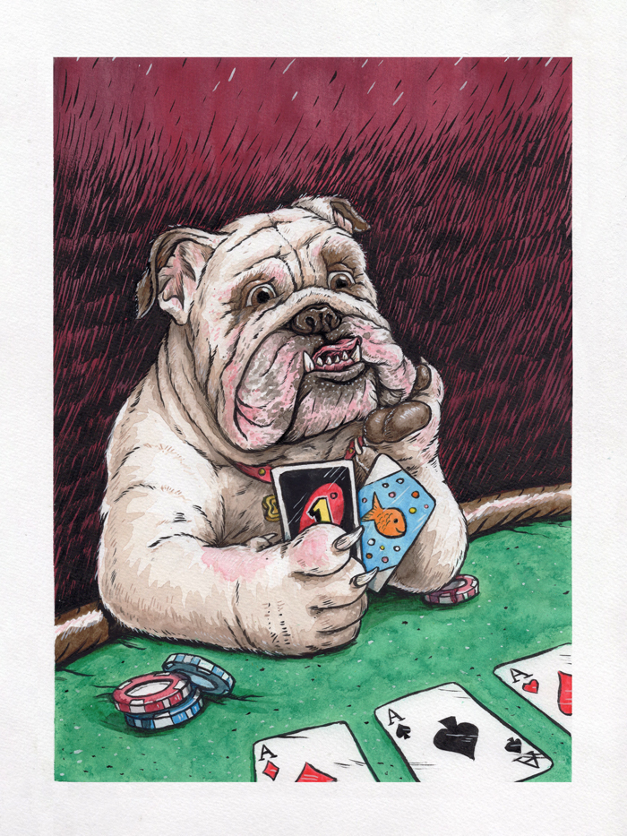
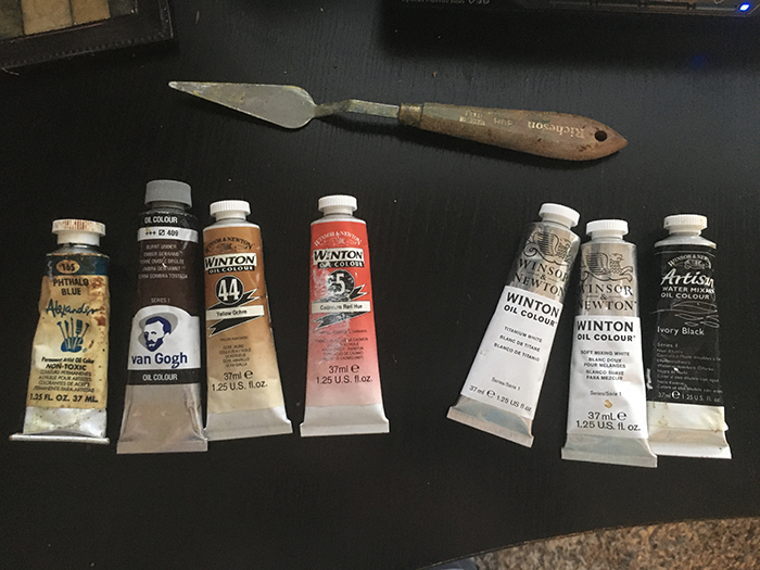
Since then, we’ve met twice, and plan to continue Zoom meeting once a week or two to keep each other moving forward. In our first meeting, we chose that we would all paint a portrait of Ben’s bulldog, Winston. I’ve chosen to work in oils for the first time since… 2006?… and got a rough sketch and color palette ready to share at the next meeting. Unfortunately, that meeting wasn’t able to go down, because work got a little out of hand at the last minute for Ben and Jason. Well, I didn’t want to start on the oil project until I’d gotten feedback on the rough sketch, so I decided to not sit around (I’d been doing way too much of that already), and threw myself into a quick ink, watercolor, and gouache warm-up illustration. I call it “Bulldogs Suck at Poker:”
I really love how it turned out, and it already has my mind spinning about thinking up different things that animals surely suck at.
But back to the real painting. Here’s that rough sketch, and the color palette I’ll be sticking too:
Since this is going to be a long term project (because oil takes forever to dry), I’ll keep you posted as updates are available. My favorite take away from the new art group (aside from hanging out virtually with my friends and not talking about work for a change) is that it’s snapped me out of the slog and has made me super productive again. Evidence being (aside from the extra painting I already made just to surprise the group)…
PROJECT UPDATES
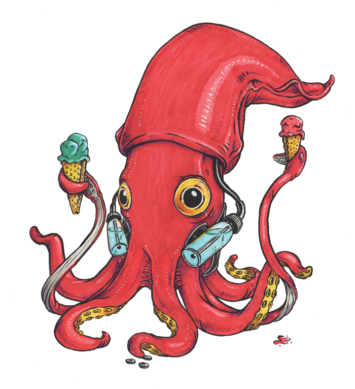
During my short term art depression, I fell behind on Inktober 52. I think a big part of this was because for the month of April, colors were required for the prompts, so I knew it would take me more time than I had the energy for. Once I told myself to grow up, I decided to use the color as a reason to play around with Copic and Spectrum Noir markers more, and that’s proven to be really fun. Here are the drawings I’ve made for the series in the last month – I particularly love the squid:
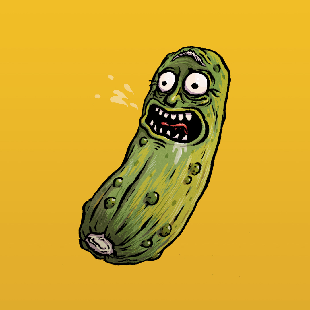
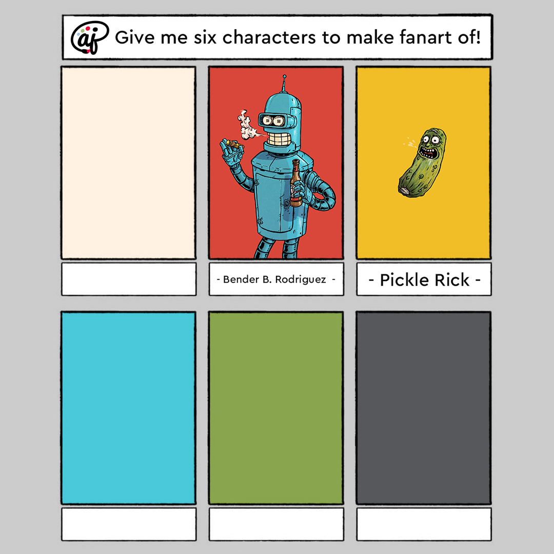
#6fanarts is a thing on Instagram, so I decided to jump on that, instead of the Batman comic page I was planning to make, mainly because I new that this project would push me closer to the direction I want to go. Here’s how it works: you ask your followers for which characters they’d like you to do fanart of in your style, and you pick which six you’ll make. I’m using the project to force myself to get better at painting in photoshop underneath my ink work, and I’m starting to develop a process that I’m comfortable with that’s not far from my ink and watercolor style, that will work well for graphic novels and comic strips. Here’s what I’ve gotten so far:
Follow me on Instagram to be able to see new illustrations for Inktober 52 and 6 Fanarts (as well as updates on everything else I’m working on) as soon as they come out.
This month, I have room and forsight in my schedule, so I’ll be taking part in SVS’s May illustration contest, “Isolation.” After some really basic ideas, I’ve settled on showing a chimpanzee/inmate relaxing in his enclosure/cell at the zoo/prison. This isn’t a political statement, but more of a riff on how I would illustrate The Far Side. Here’s the thumbnail of the concept I’m plaing with, in two orientations. I’m pretty sure I’ll do this as an ink and watercolor, but part of me wants to just jump in and use it as way to practice with gouache. But I also kinda want to win, so….
We’re one week away from Easter, and I’m just starting to wrap my head around the fact that we’ll all be spending it shut off in our own homes. This morning, I ran to the grocery store and grabbed some candy, chocolate, plastic eggs, and baskets for my kids, so that the holiday can feel as normal as possible. We’ll even put on some nice pink clothes, which is weird, but all of this is weird.
Speaking of weird – my vector illustration process. So far in this blog, I’ve focused mainly on traditionally produced artwork, but I’ve been a professional graphic designer since 2008, so most of my work is actually created digitally, using Adobe Illustrator. Illustrator is fun primarily because it looks like witch-craft to anyone unfamiliar with it. I think most people can understand Photoshop in the abstract (you’re painting… but on a computer!), but creating vector artwork in Illustrator (you’re making art with points and math to insure infinite scaleability?), not so much. Which is a shame, because it’s really versatile.
Let’s take a look at my vector illustration process using my Adventureland poster project as an example.
STEP 1: THUMBNAIL SKETCH
I created this, along with three other thumbnails for the other posters in the series, so that I could show the client my rough idea for the layout, and what elements/attractions from Disney World’s Adventureland would be featured. Pretty sure the whole set took between 10 and 15 minutes, because each design was really clear in my head. Now, when I pitched it to the client, I included a detailed explanaition of what was going on, but for my purposes, this was good enough for me.
STEP 2: FINAL SKETCH
Once my client responded back with approval, I printed out the reference images I’d googled, blocked out the frame on some 14×17″ bristol paper, and got to sketching. I feel like this sketch took somewhere between three and four hours to knockout, primarily due to the pirate ship. 1) There wasn’t a reference image from the Pirates of the Carribean ride that showed the angle that I needed for the illustration, and 2) I don’t recall ever drawing a pirate ship before. That doesn’t mean I hadn’t as a kid, but I have no memory of it. This created a fun challenge to tackle.
STEP 3: COLOR TEST
After the final sketch was completed and I’d scanned it into the computer, I created this insanely simple color sketch. I’d already pitched the color palette that I intended to use to my client when I sent over the thumbnail, but I wanted an abstract view of how the colors would work together with the Adventureland layout (for my eyes only). This is a step that I would definitely call “productive procrastination.”
STEP 4: COLORING BLOCKING
At this point, I placed the sketch on the first layer of my Illustrator artboard, set the transparency to 50% and the blending mode to Multiply, so that I could create the artwork underneath without losing my guide (which is all that the pencil sketch was ever going to be). I then pull out an extremely sophisticated tool that makes all the magic happen.
That’s right – the humble mouse. That’s all I use to create all the points and vertices needed to form the outlines of all the shapes that build up the illustration. In my mind, a stylus is for Photoshop, and the mouse is for Illustrator. They’re different programs that function very differently. It only makes sense to me to use different tools to subconsiously reinforce this as I work. Plus, in my experience, the mouse is just faster when clicking vertices out.
For this step, I’m just focused on blocking out the overall shapes and color sections of each character or element. These are also given their own layer, as to cut down on the chance that I will go insane as the illustration gets more and more complicated.
STEP 5: ADDING DETAIL
Now, I go through each big color blocked shape and drill down with more detail. Since I’m basically just tracing the pencil sketch on this step, I like to work the vector in as red or magenta lines. These colors stand out the strongest underneath the pencil lines, so I never lose track off what has and hasn’t been outlined. Also, they are exceptionally fashionable. Two birds; one stone.
Once all the red outlines are in place, I assign each outlined shape a color from the set color palette, then make sure everything is arranged from front to back in a way that will allow everything to overlap correctly (which is basically a digital version of placing colored paper cutouts over each other).
STEP 6: ADDING SHADOWS
The last step is to add the shadows (for this posterized process, I don’t add highlights in Illustrator), which is done by adding one of the darker colors over the flat color blocks at ~25% opacity on a Multiply blending mode.
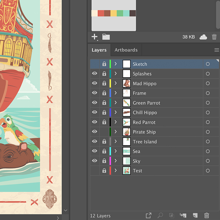
Steps 5 through 7 are done for each element in the illustration, but sometimes I do them piece by piece (for example Blocking, Adding Detail, and Adding shadows to the hippo before moving to a parrot), and sometimes I do them for the whole illustration at once. It really just depends on what rhythm feels better on that day. And, just if you’re curious, this is what all the outlined shapes on the illustration at this point in the process look like all together:
Wow. Now I understand why this (and each poster in the series) took at least 30 hours to illustrate. But, to me, it’s worth it, because everything is individually scalable and editable in a way would either be impossible or cumbersome in Photoshop. This illustration would be just as easily produced on a stamp as a building wall.
STEP 8: CREATE THE FRAME
These travel themed posters are all tied together by their frames, so on this step I designed the four tiki masks and swashbucklin’ swords, x-marks the spot graphics, and then added a weathered texture over all of it.
STEP 9: REVIEW ALL THE VECTOR WORK
This step is short and fun, the carrot at the stick of all the late nights sitting in front of the monitor wondering when I’ll let myself go to sleep… or if I will ever see sleep again. Once everything is “done” in illustrator, I turn all the layers off, then add them back in back-to-front, and watch the illustration come together. It’s at this point where I give myself one last chance to to see if I’ve missed anything, if I want to move anything, or if there’s anything else I want to add.
Personally, I find it hypnotic, especially considering it’s usually 1 a.m. whenever I find myself at a finishing point. Somehow it always works out that way.
STEP 10: FINISH OFF IN PHOTOSHOP
Now, this isn’t a step that I do for most vector work, but for these travel posters (for which I’m intentionally going for a retro, screenprinted look) and a couple of my Flat Pops, I do drop the finished vector art into Photoshop. All I do is grab an old-school grainy brush and lightly reinforce some of the shadows with some texture, to get a little bit of a spatter/half tone look.
WRAPPING UP
Projects vary in complexity, but I invariably do steps 2, 4-7, and 9 for all of my vector work. It’s challenging and fun, but by the time I finished this set of posters (the last two of which still are waiting to be released), I feel like I may have pushed Illustrator as far as I can for the sort of work that I make. This leaves me two paths: to go backwards into more simplified or abstract vector work, or to start working more in Photoshop. And the answer to that, I feel, is yes.
Both.
Oh, and if you want to buy a tee or tank top with the Adventureland print on it, you can pick it up at Nick & Lete.
PROJECT UPDATE
Well, seeing as I just spent this weekend mostly sleeping to recover from full-time homeschooling/working from home, I don’t have a ton of update at present.
I’m running an Instagram promotion for my emergency coloring pages (found here) because I want as many kids and parents as possible to have as many resources as possible to get through this pandemic shut down. So far, 63 people have downloaded the PDF, and that makes me happier than all the shirts I’ve sold on TeePublic to date. I’ll have that PDF available for download until everyone in America is able to go back to school and work.
For fun, and to get myself in the graphic novel mindset (besides all the Batman I’ve read in the past couple weeks), I’m going to put something together for a mini-challenge on the SVS Forums. A blank comic page (with the panels, of course) has been posted, and you come up with whatever story you want. Should be good practice.
Tonight, once the kids are asleep, I’m jumping back onto character design for my graphic novel project that’s sat dormant for 5 years. So the iron is hot, so to speak. I’ve also planned out the month to set some time aside to get the ball rolling on my Narnia cover project and Gravity Falls character paintings. That is, unless the world goes crazier.